How Bairros was made
The idea
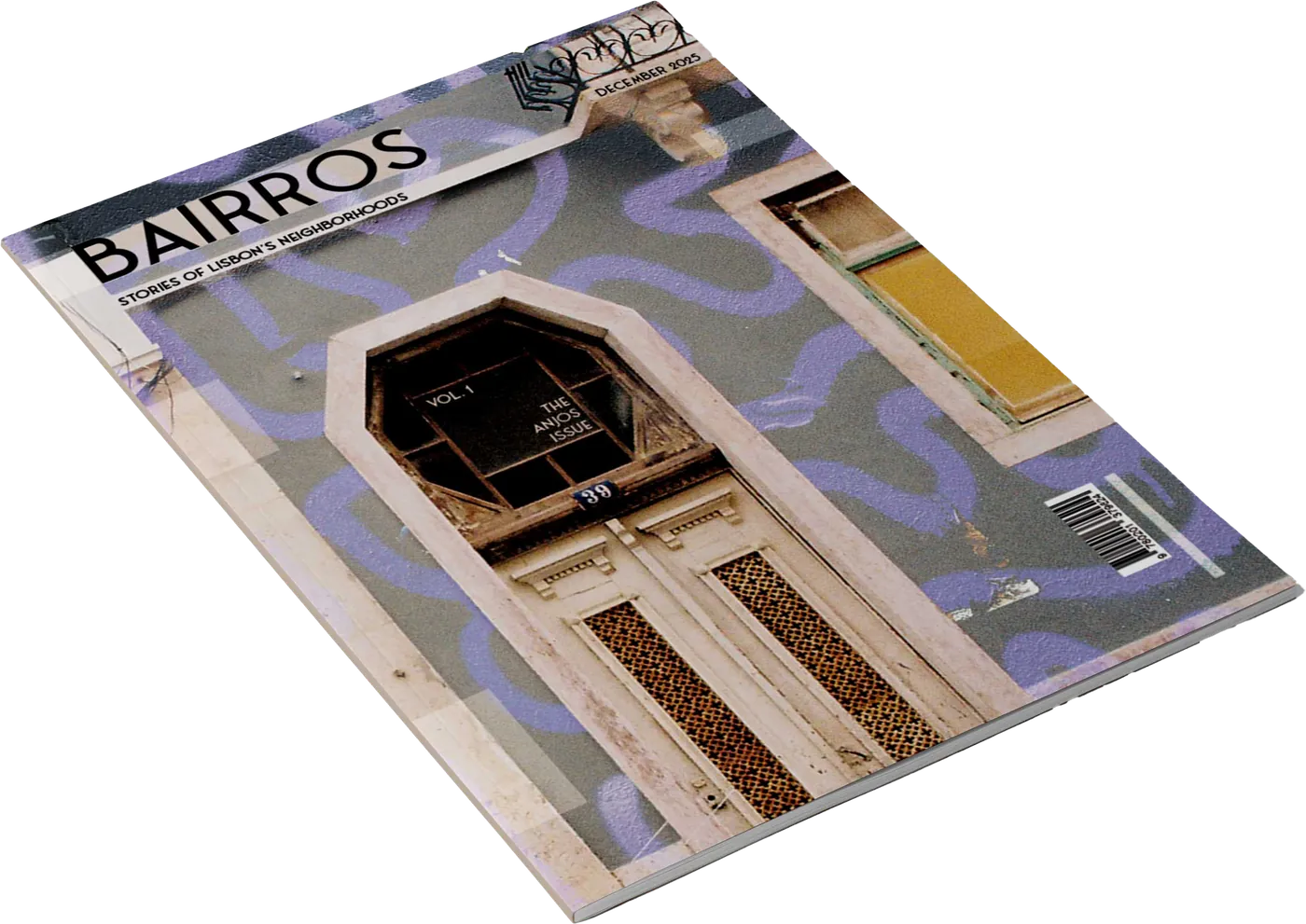
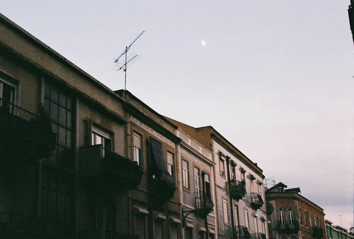
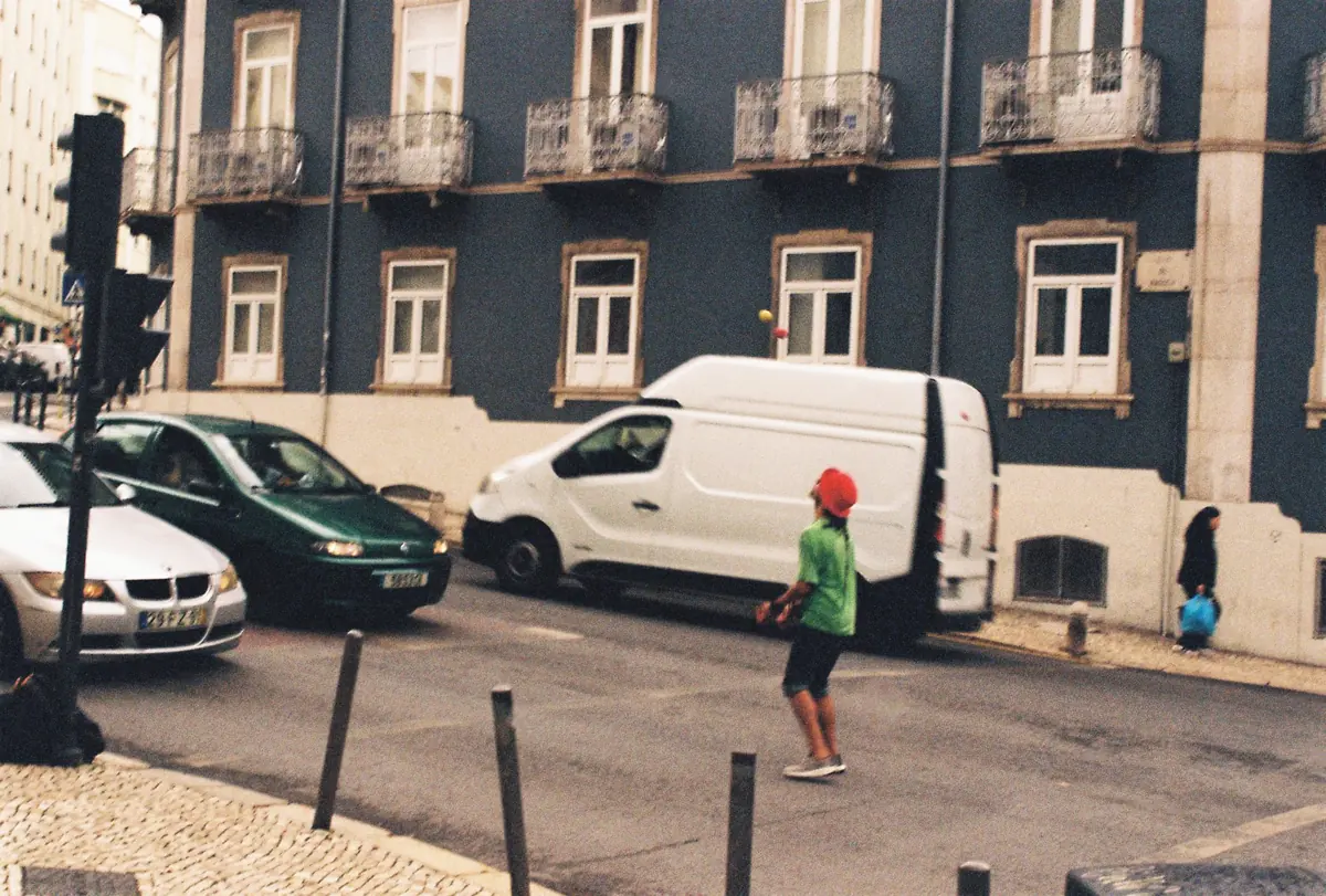
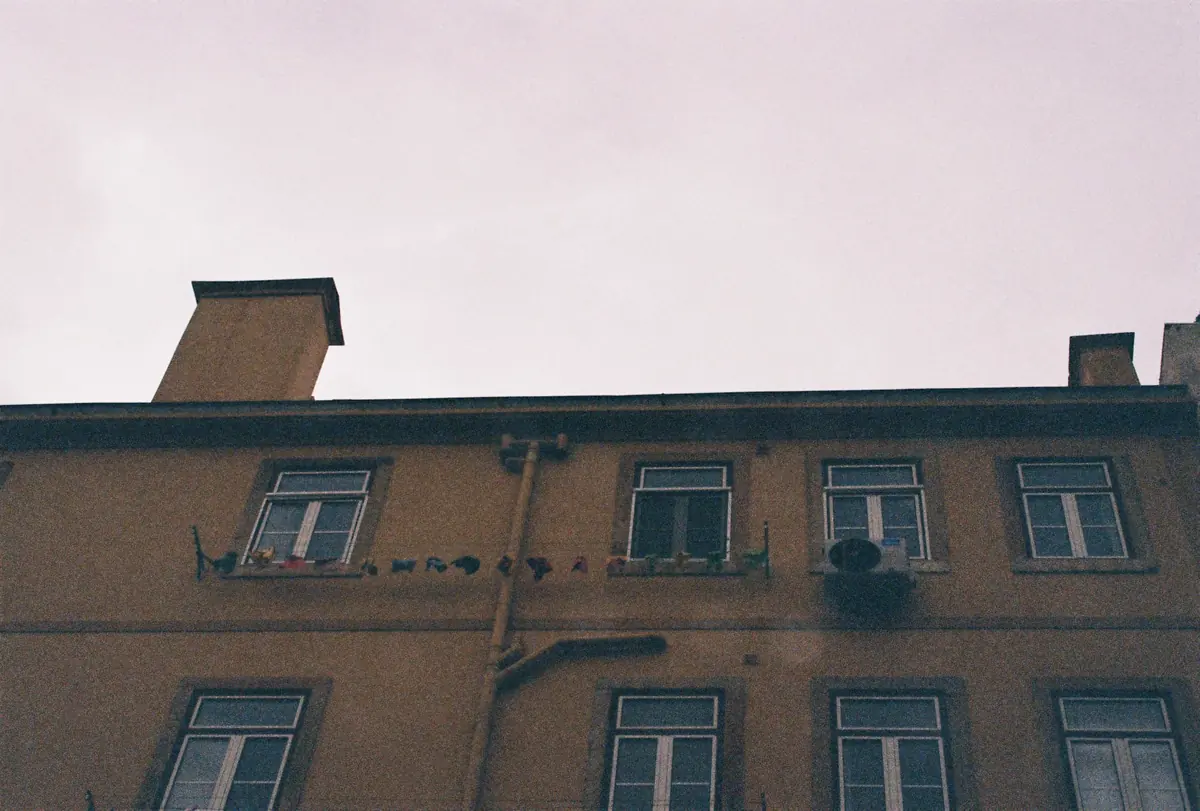
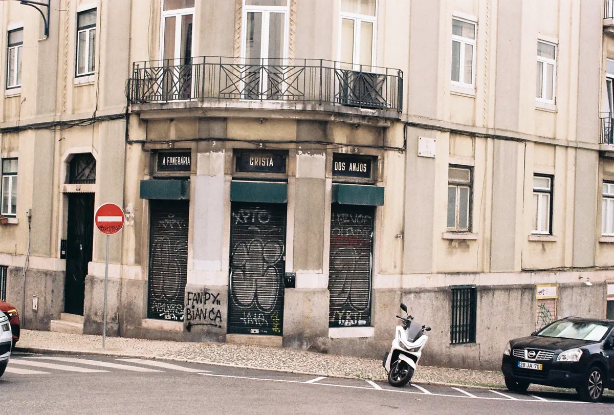
The closed down funeral home sparked the idea. I walked past its signs every day, taken by the typography, and started researching how the neighborhood has changed and keeps changing. What I found was a dynamic place full of history and layers, reflected in the analogue photographs I took around Anjos. Bairros is a diary entry and a love letter to Anjos, and it only scrapes the surface of the detail scattered around for a curious observer.
Bairros is a magazine about the neighborhoods of Lisbon. Each issue focuses on one area and tells it through analogue photography, stories, observations and local encounters. I chose a name flexible enough to work across neighborhoods, and changed it from Bairro to Bairros to avoid confusion with Bairro Alto.
Moodboard
I was looking for editorial projects that were experimental and whimsical: playful, layered, full of texture and color, messy yet structured. One that stood out was the WePresent issue Paula Scher designed for WeTransfer. It was a highly commercial commission, and she used generative AI, yet she still made it fun, fresh and artsy, and even found room for her own typography NFT. My favorite part was a day in the life of her dog, Mimi.
Cover & concept evolution
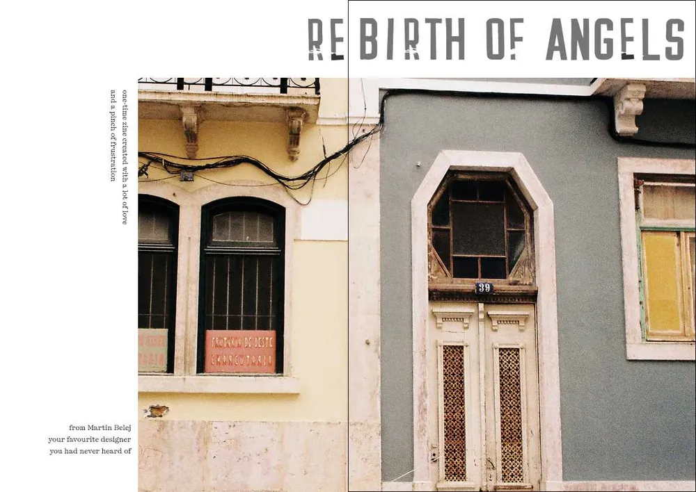
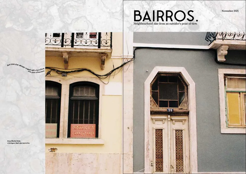
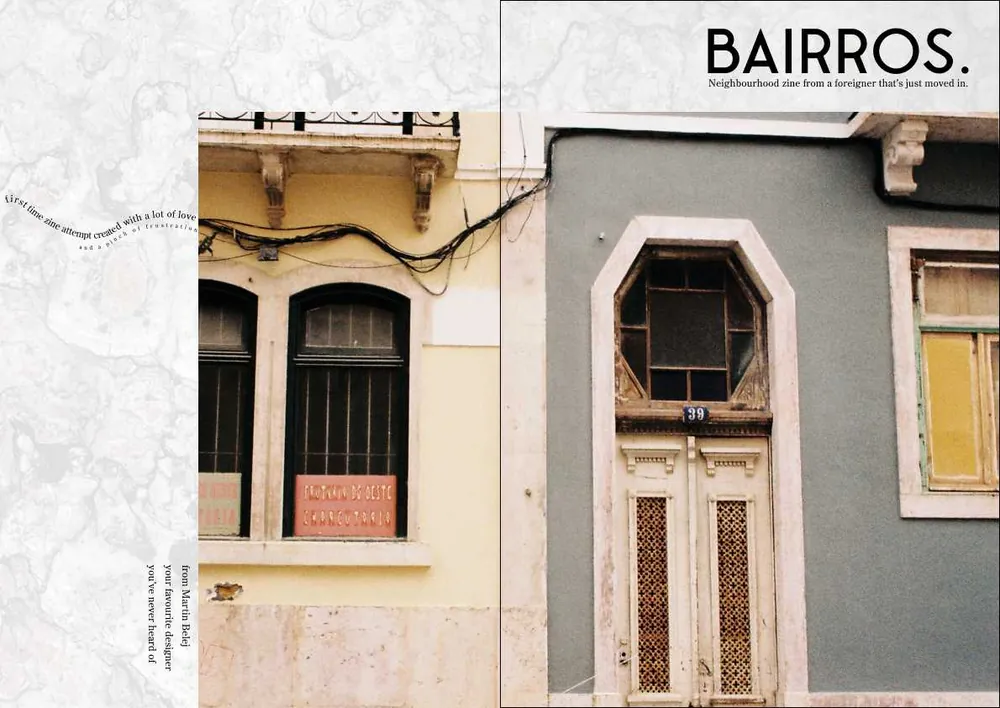
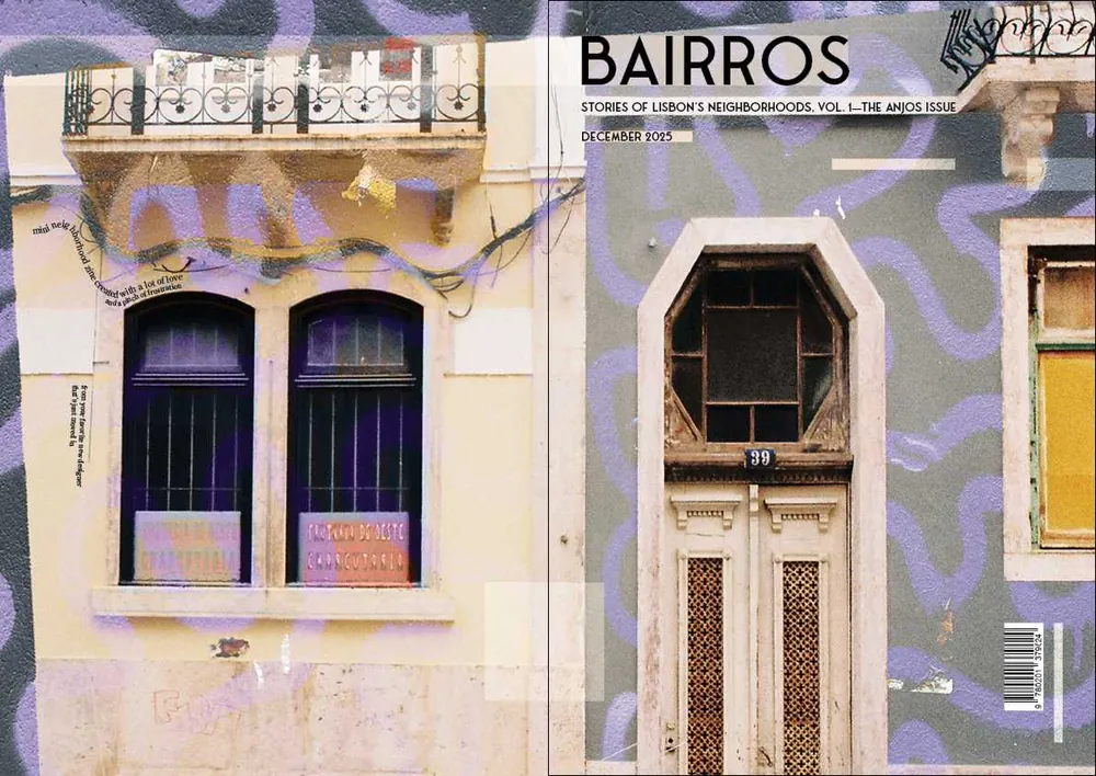
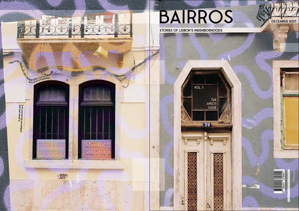
Everything started with the cover. I wanted it to say what the whole magazine is about, and the name, the typography and the style fell into place from there.
Typography
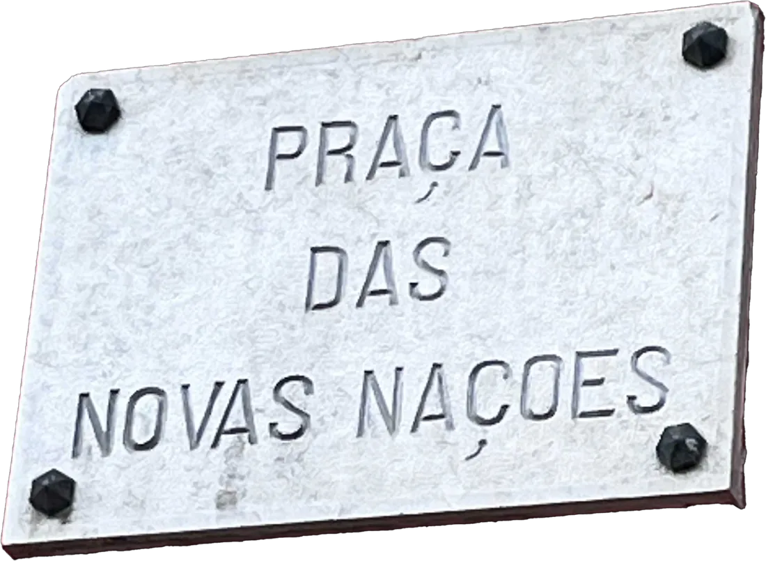
Fonseca
Modern sans serif typeface inspired by Art Deco typography. The intention was to evoke the lettering of Lisbon’s street sign plaques of the early 20th century.
Century Old Style Std
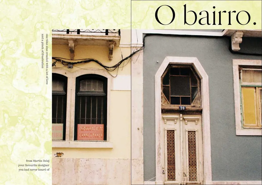
Traditional serif typeface with classical roots. A digital interpretation of Century Oldstyle typeface designed and released in early 20th century, it was chosen to contrast and supplement Fonseca and create a clear visual hierarchy.
- Fonseca Thin 72 pt
- Magazine title; section/article headings, large
- Fonseca Thin 55 pt
- Section/article headings, regular
- Fonseca Thin 21 pt
- For section/article subheadings
- Fonseca Thin 13 pt
- Small headings, quotes
- Century Old Style Std Regular 13 pt
- Article intro
- Century Old Style Std Regular 10 pt
- Body text; interview answers
- Century Old Style Std Italic 10 pt
- Interview questions; additional information
- Century Old Style Std 8 pt
- Footnotes
Structure
The issue follows an order that simply made sense: cover, editorial and credits, contents, a run of articles, the main article, and the interview last.



Margins & grid
A 6-column grid with a 4.233 mm gutter. The margins are 21.17 mm, 17.6 mm, 30 mm and 20 mm.

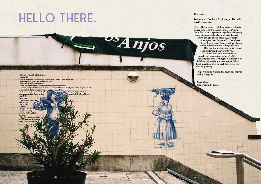
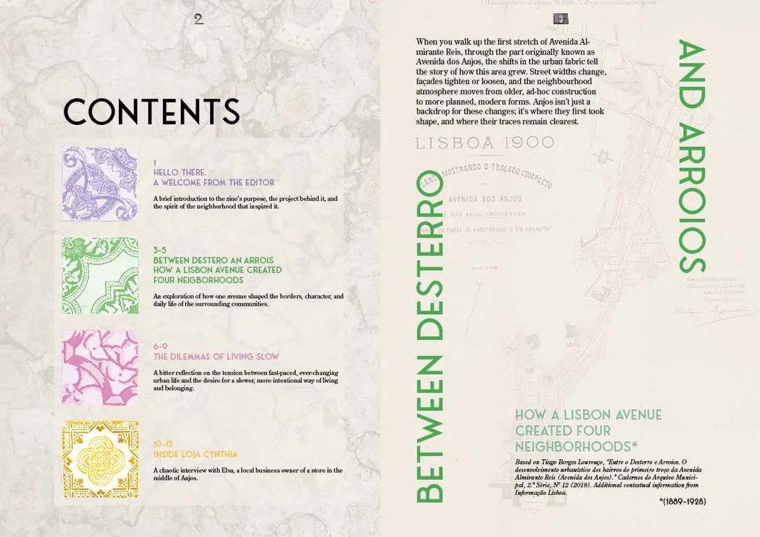
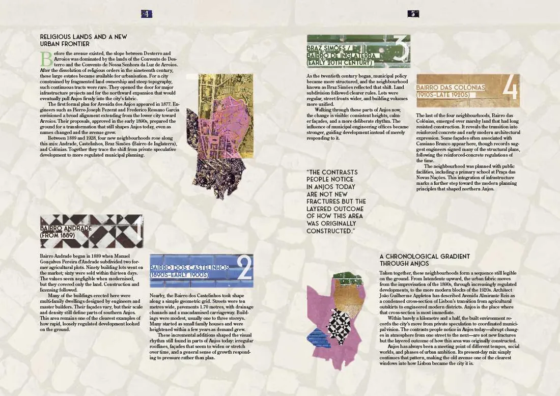
Layouts
Hover or tap a spread to see its layout



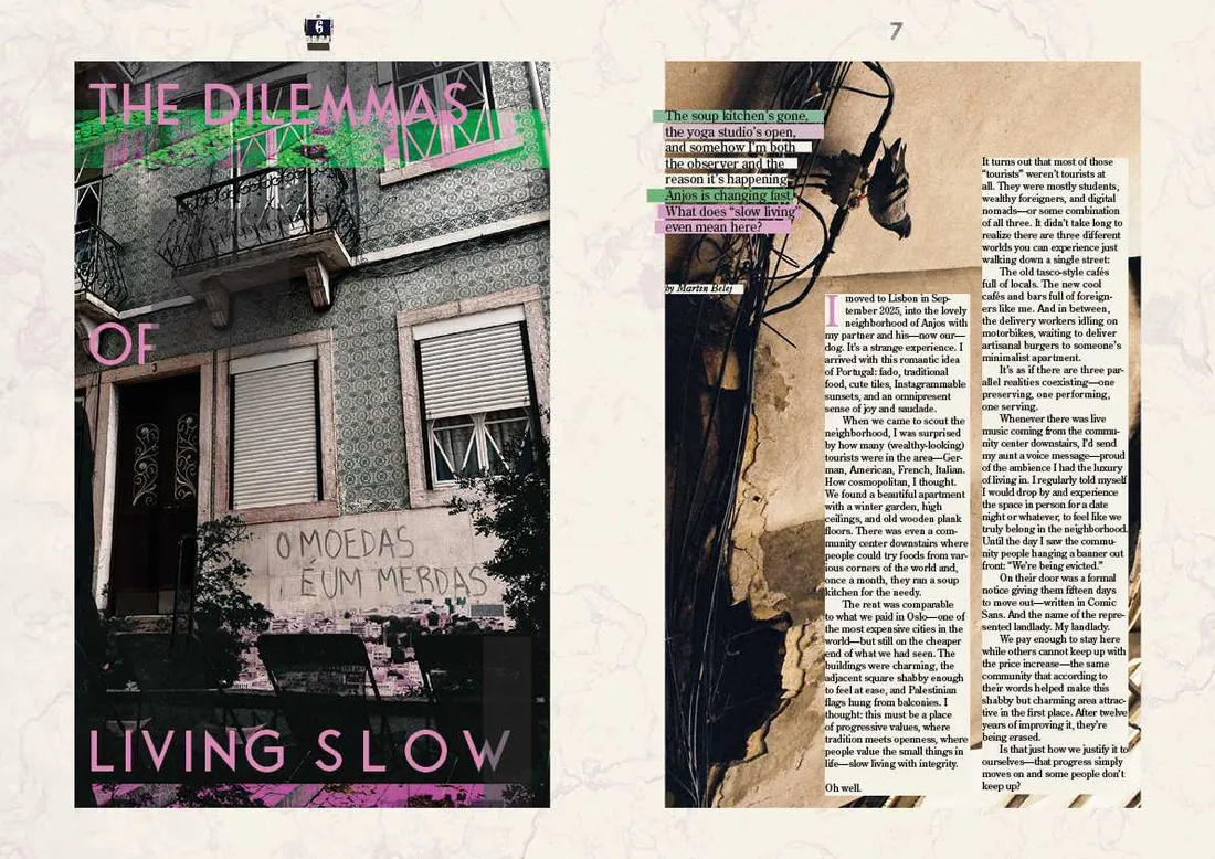
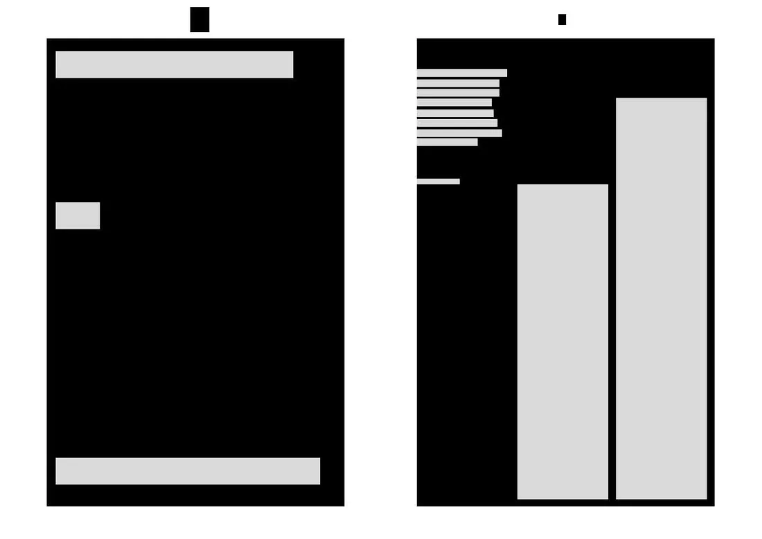
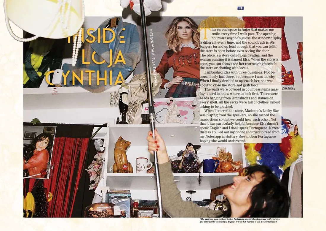
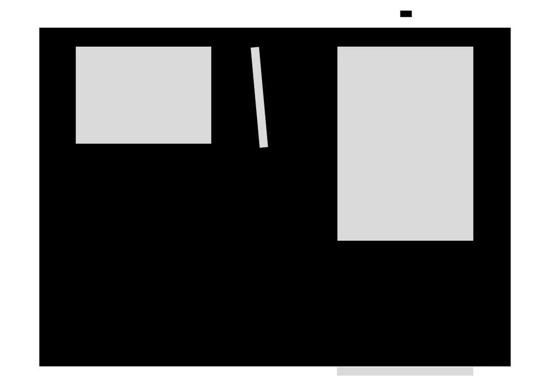
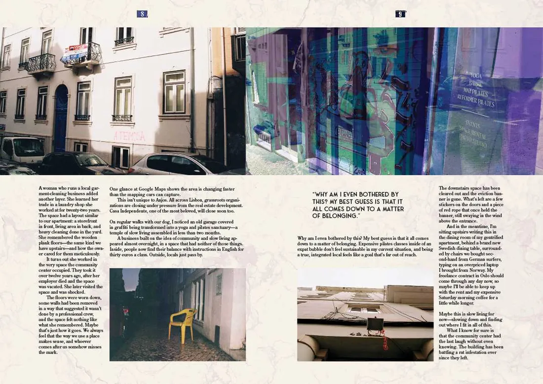

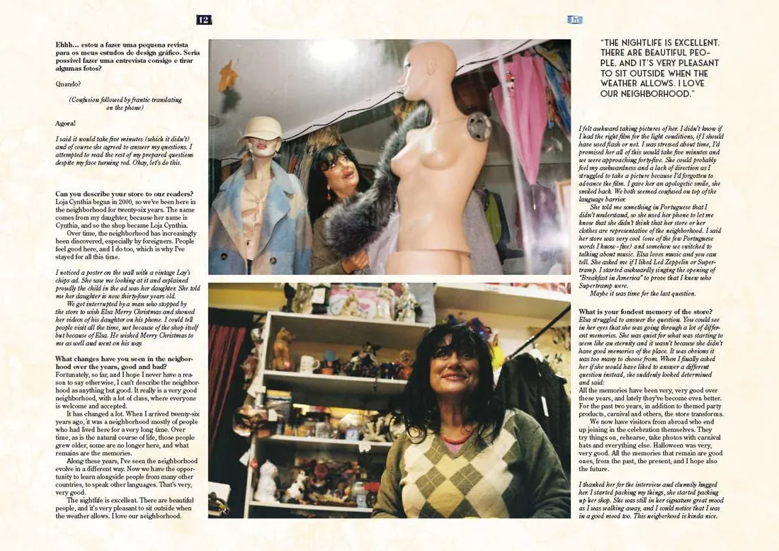

Photography
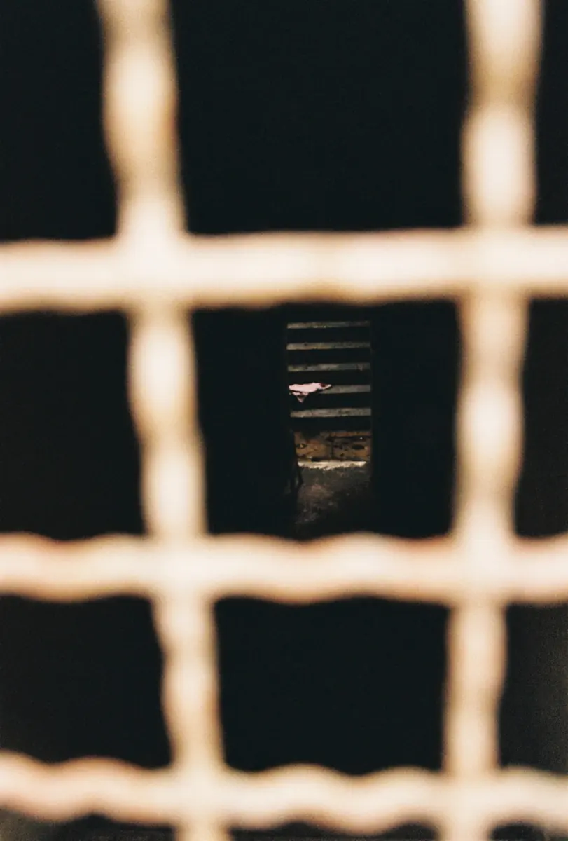
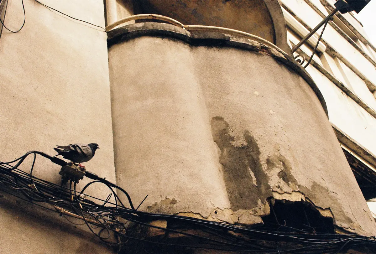
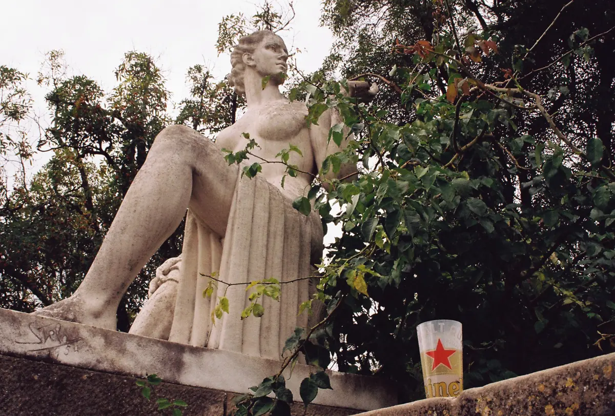
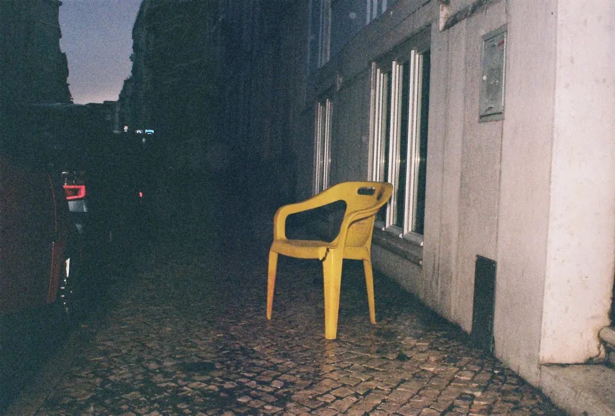
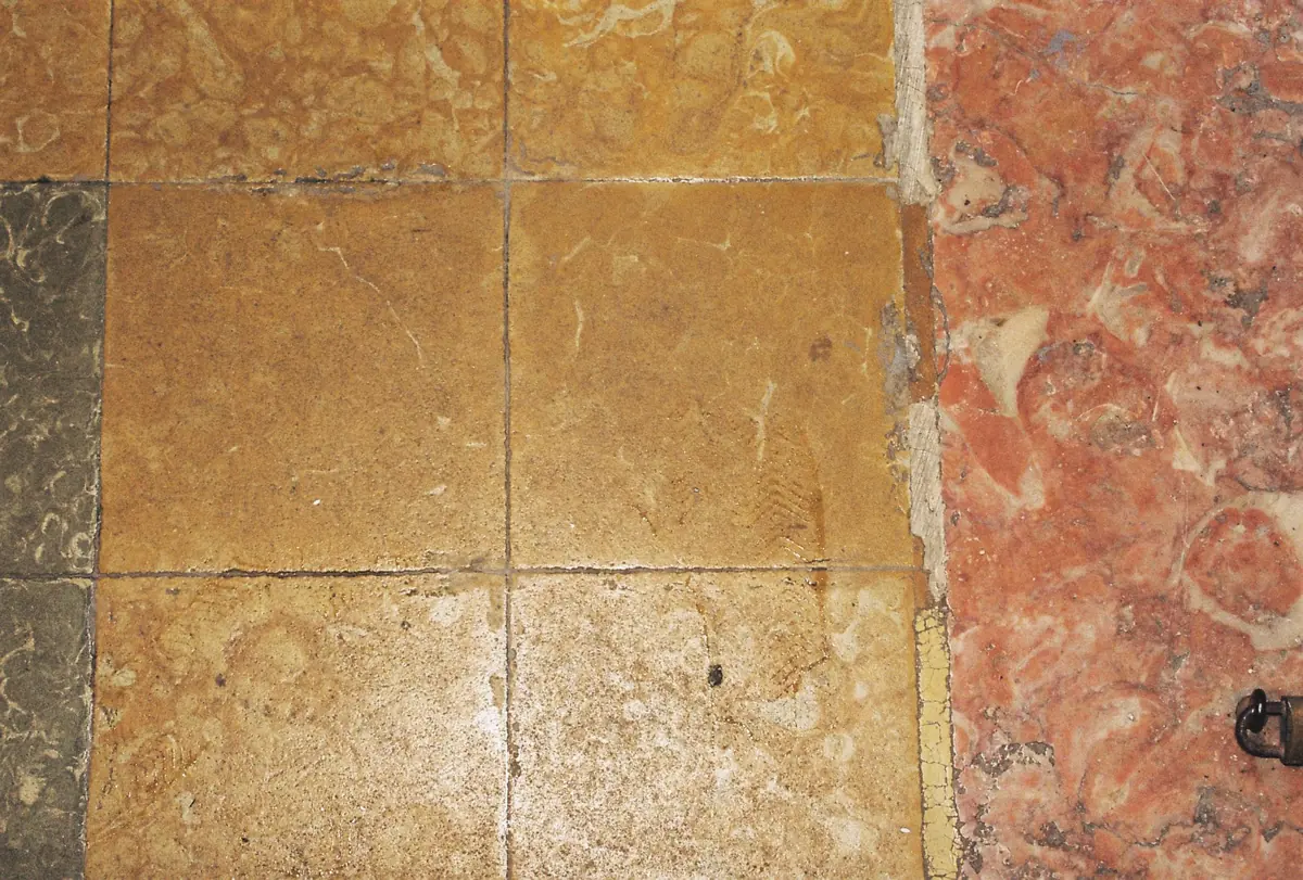
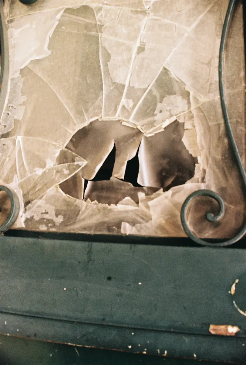
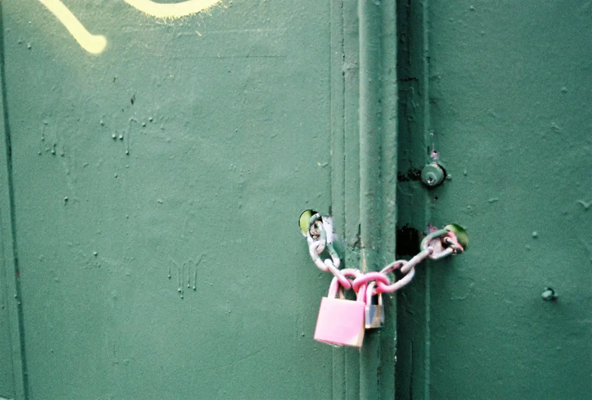
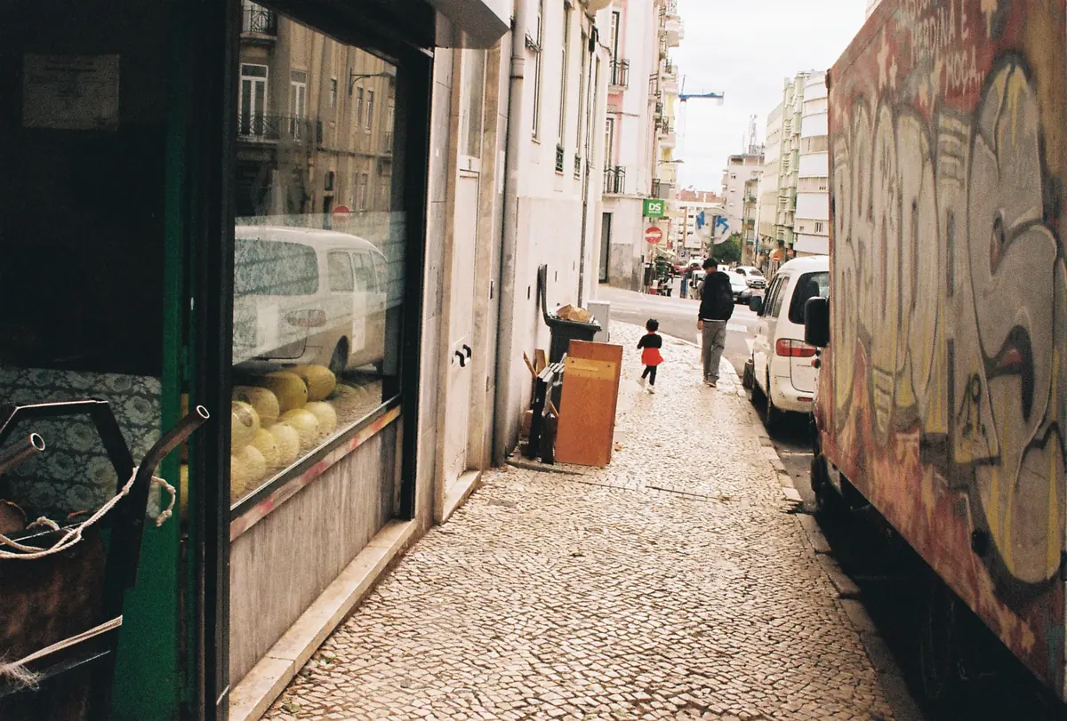
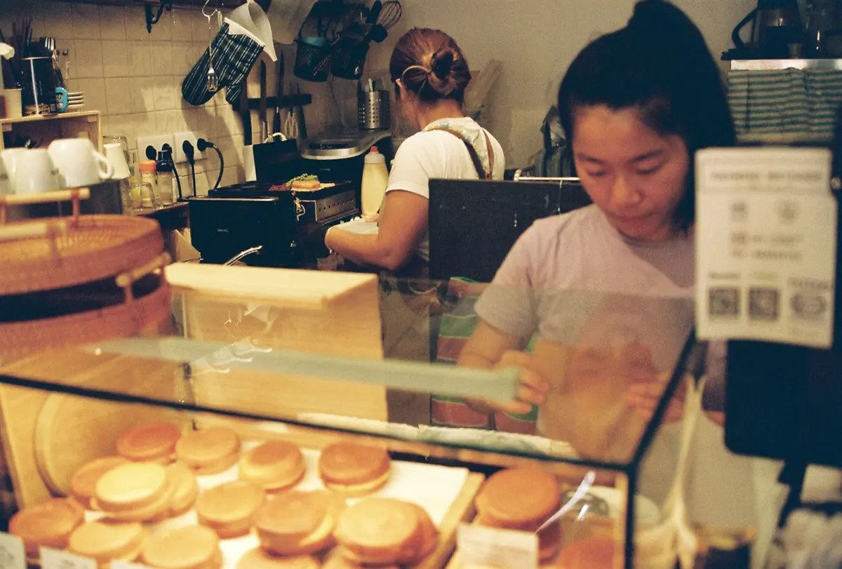
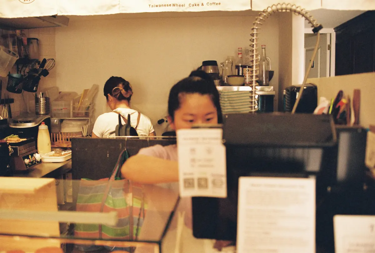
Bairros is built on analogue photography taken around Anjos.
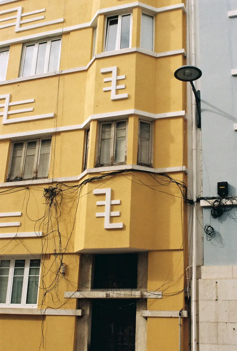
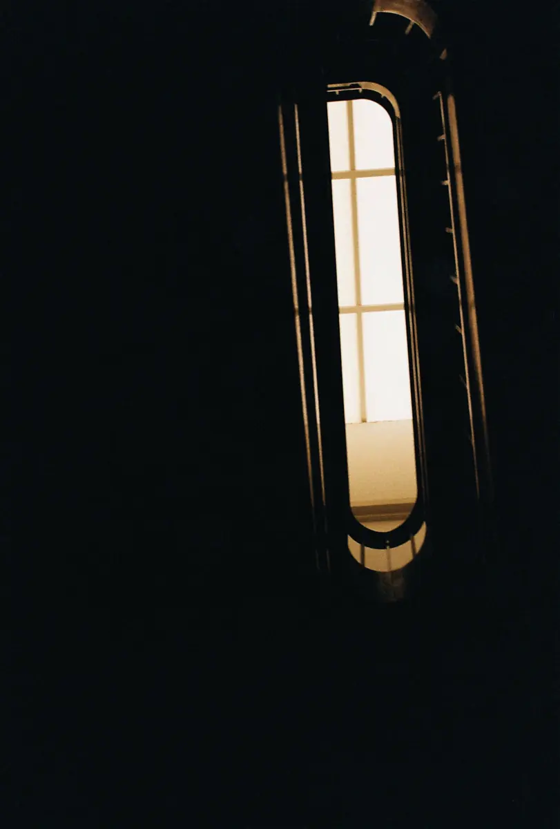
Color
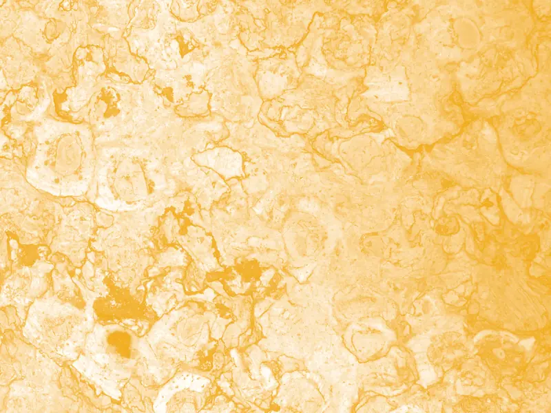
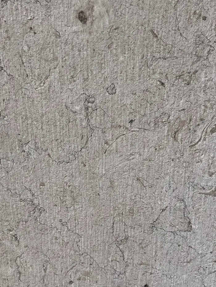
Much of Lisbon is built from limestone, the funeral home included. That limestone is full of rudists, an extinct kind of bivalve. Their soft bodies are long gone, but some theories suggest they could have been as colorful as the giant clam Tridacna.
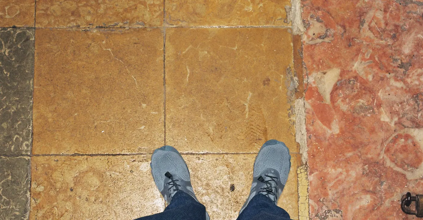
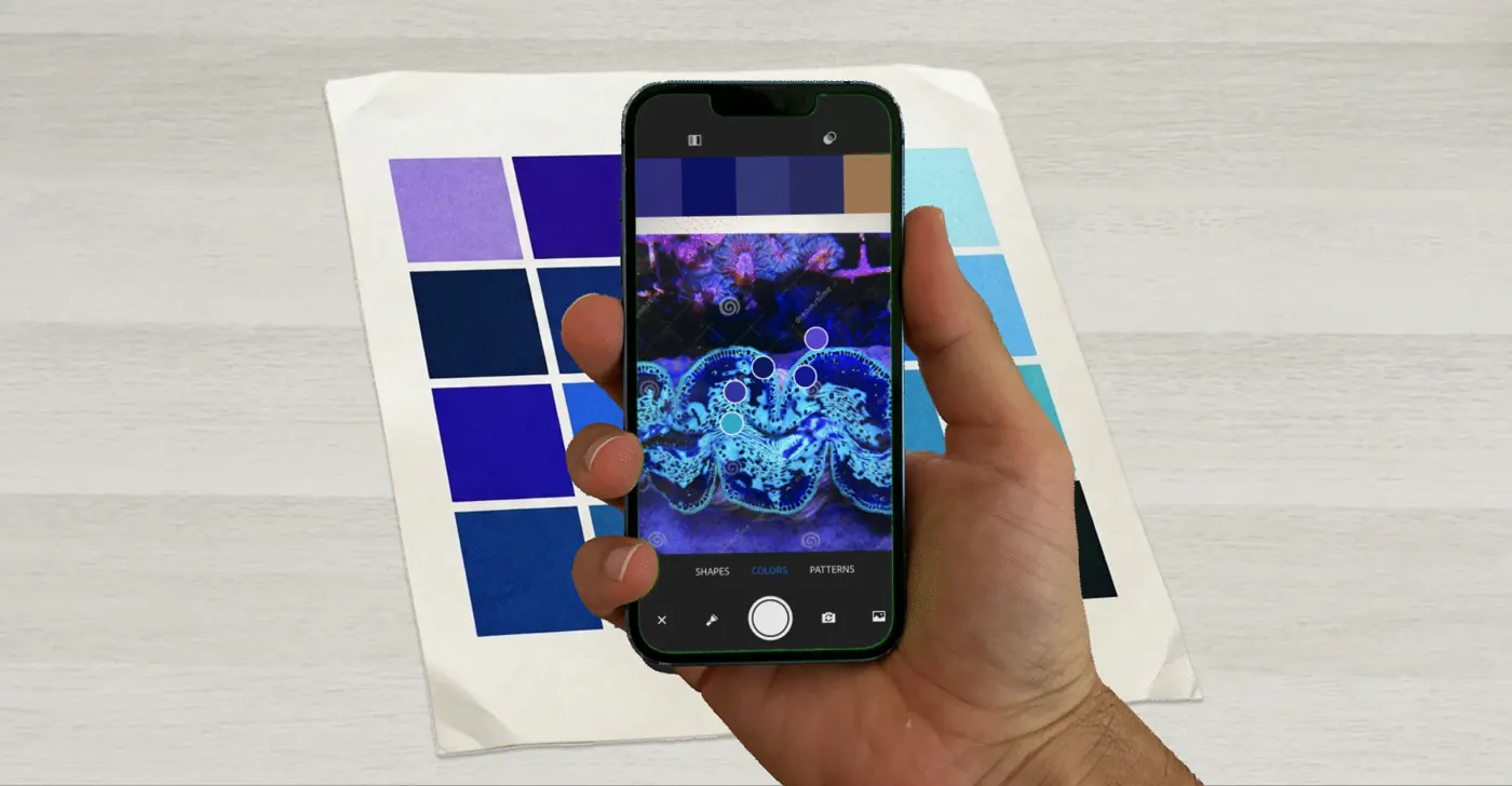
I sampled those colors and used muted versions of them throughout the magazine.
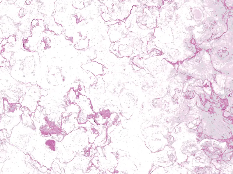
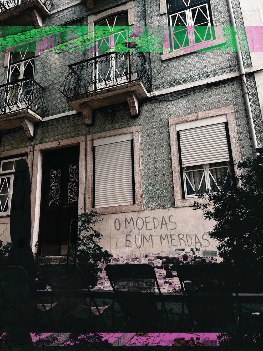
While I was editing one of the photographs in Photoshop, the file glitched and saved with a green and pink stripe. I decided to keep it and built the glitch into the rest of the design.
The details
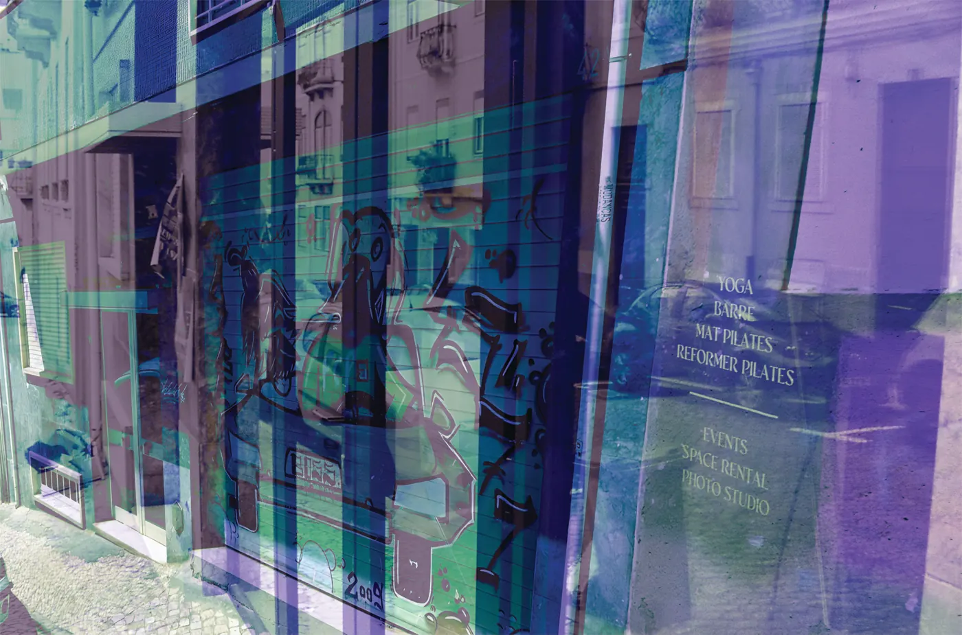
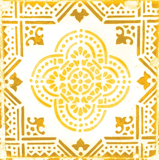
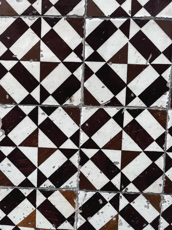
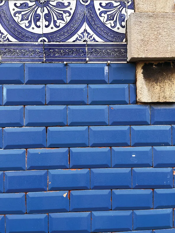
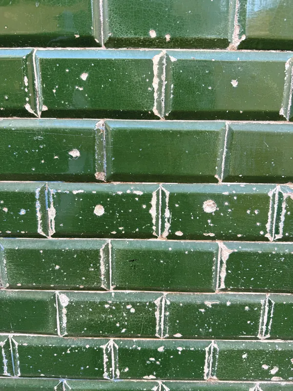
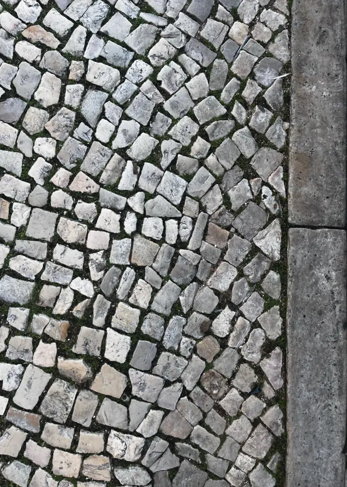
Everything in Bairros comes from local places and textures. In the magazine, the photograph of the pilates studio is overlaid with a Google Maps image of the garage that stood there before the space was converted.
Page numbers


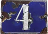


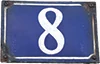
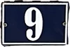
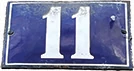
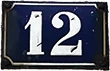

Contents tiles
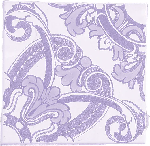
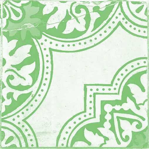
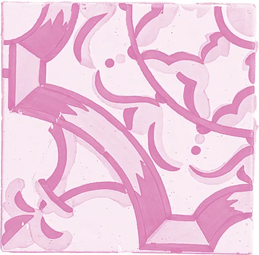
Patterns
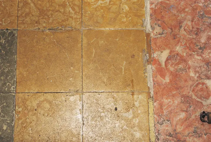
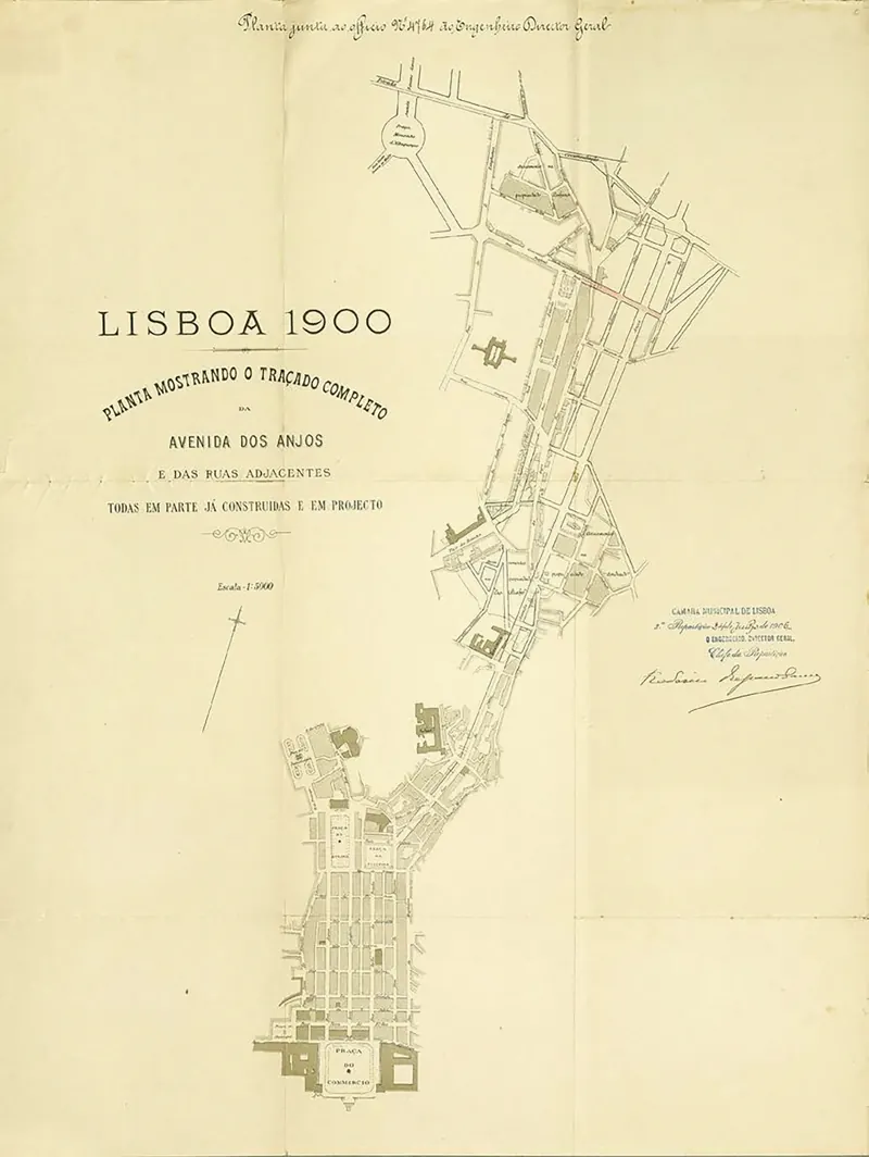
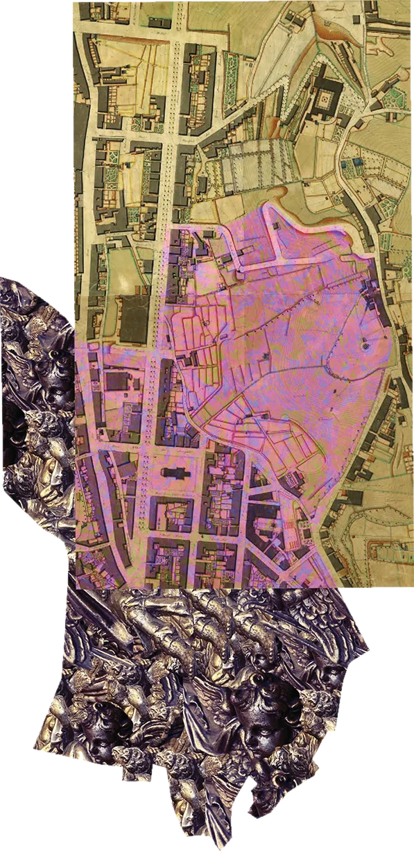
Maps
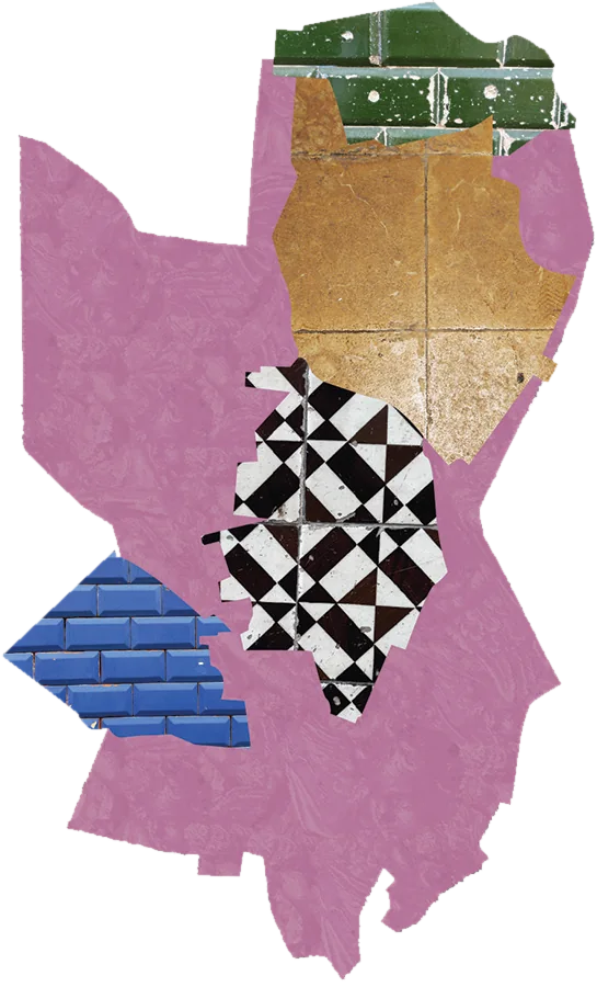
Textures
Print
Of course I had to print my magazine for real. Expensive but worth it.
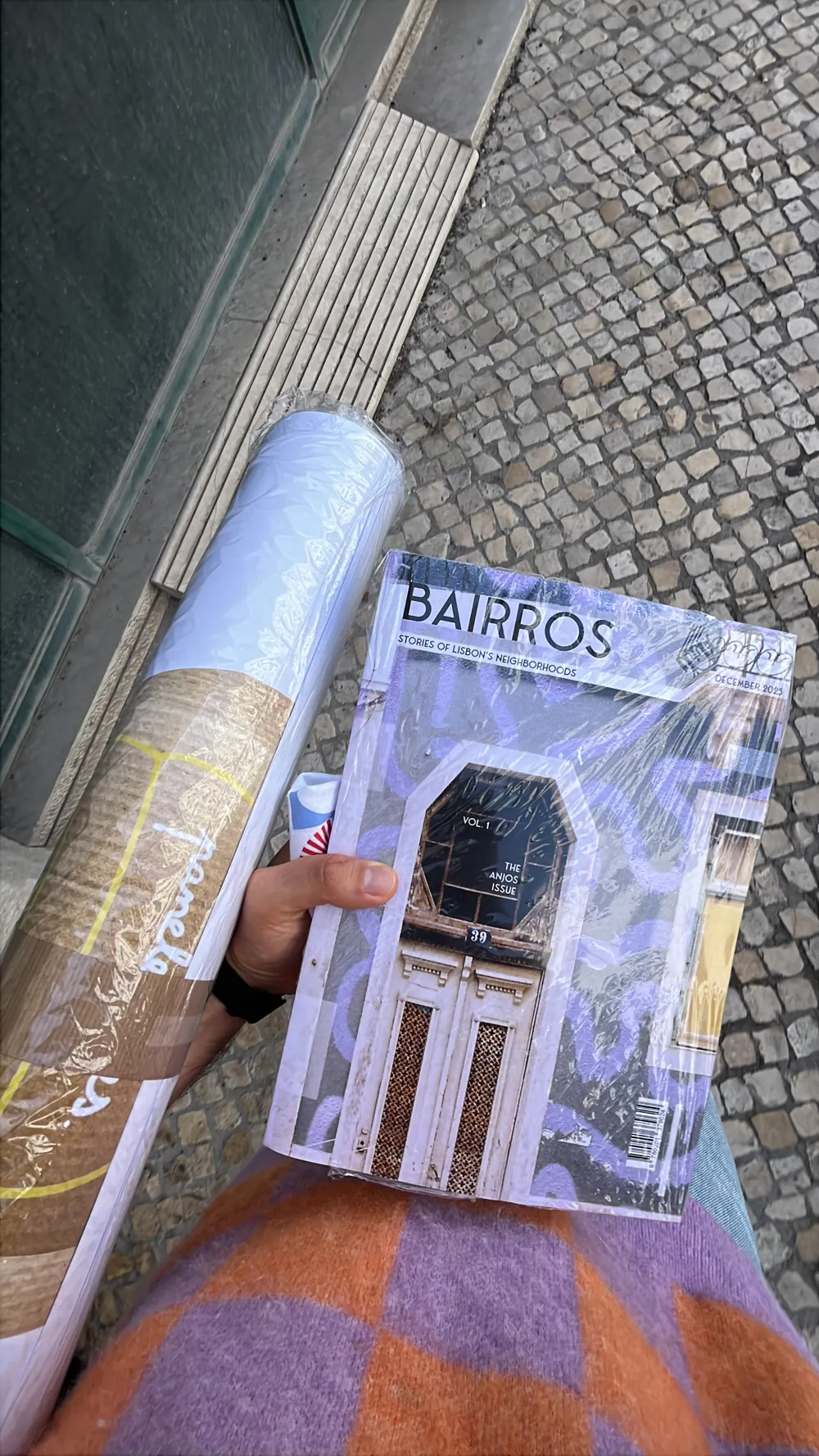
The biggest lesson was about printers. They are busy and can seem impatient or intimidating at first, but if you ask, they will gladly share what they know to help you get the best result. If you don’t ask, they won’t tell you, and many will assume you don’t know what you’re doing. Our print production teacher, João, told us that few designers know how to work with print and color, and very few ask.