Claro is a neighborhood navigator for mental health in Hamburg. I’m building its visual identity.
Logo
The compass was already the agreed symbol: it reads as “navigator” and nods to Hamburg’s maritime history.
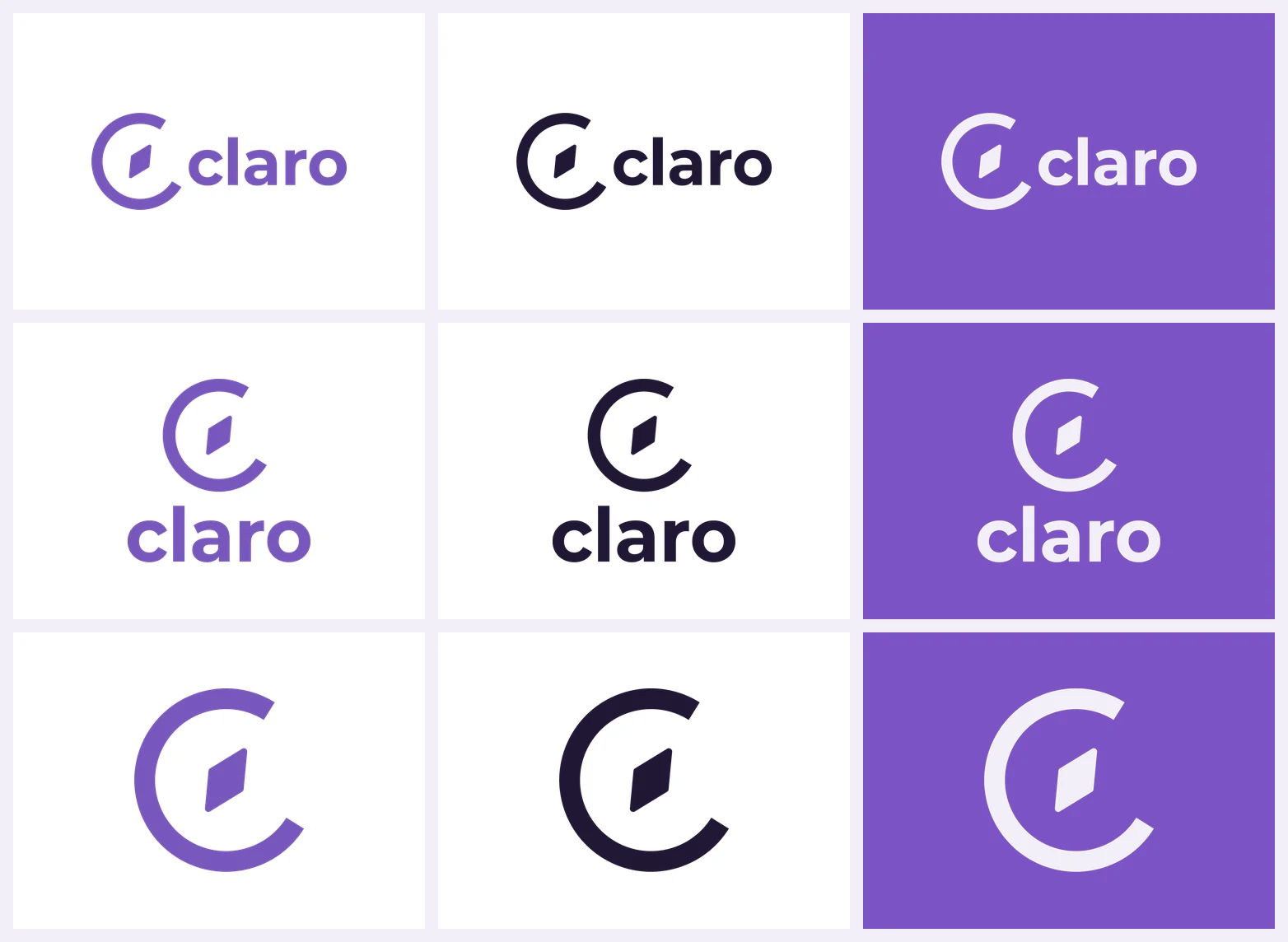
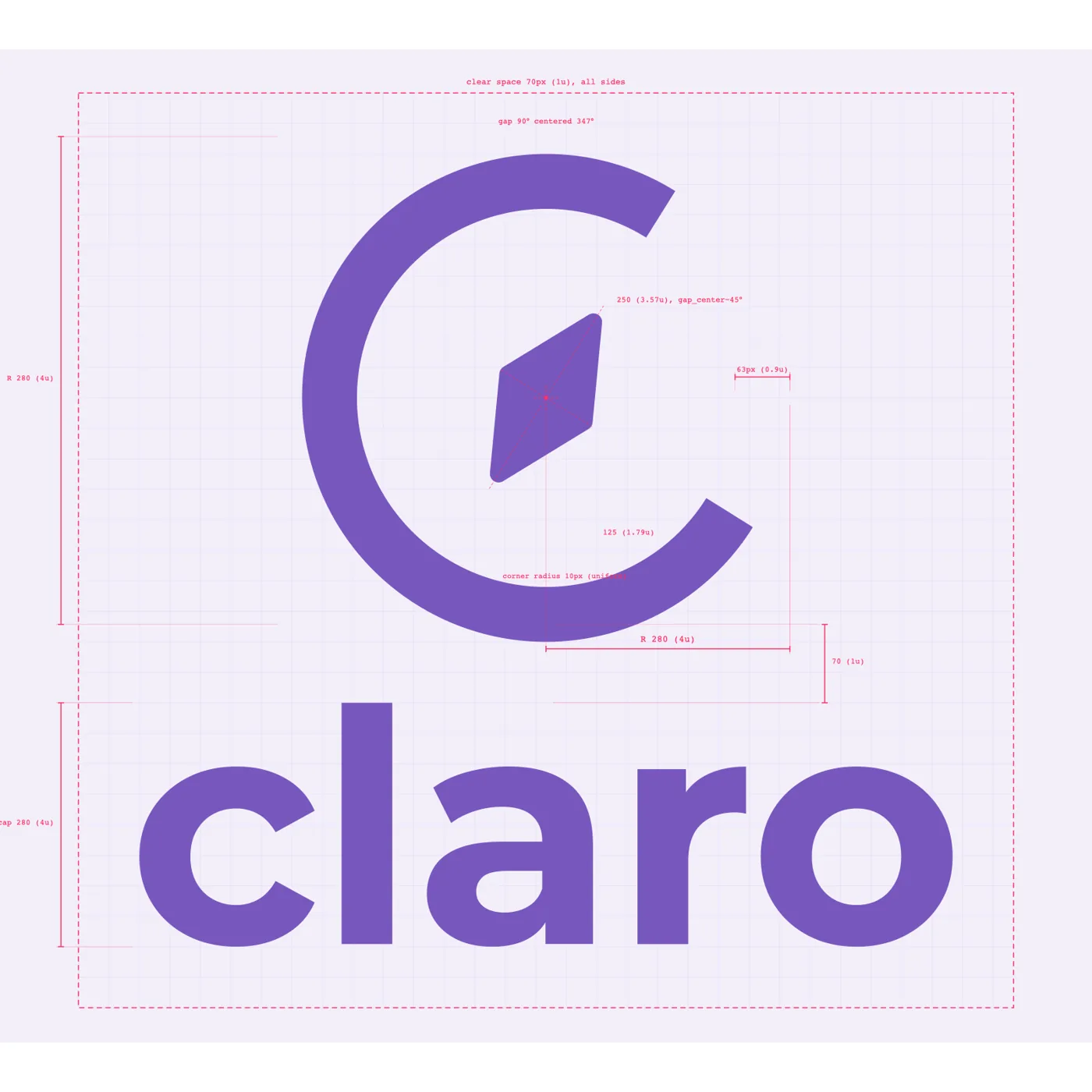
The compass was already the agreed symbol: it reads as “navigator” and nods to Hamburg’s maritime history. The job was to turn it into a finished, reproducible mark. I explored it broadly, 64 sketches narrowed to 15 and then three directions, before settling on an open ring with a rounded compass needle at its center.
The final system is built on a construction grid, so anyone can rebuild it correctly. It comes as horizontal and vertical lockups and a standalone brandmark, in purple, white and black.
Color, shapes, texture, icons
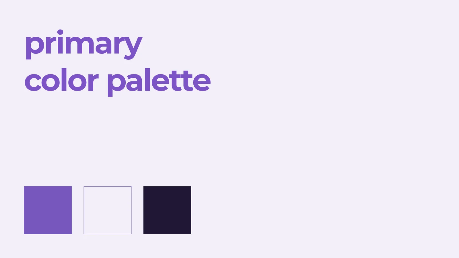
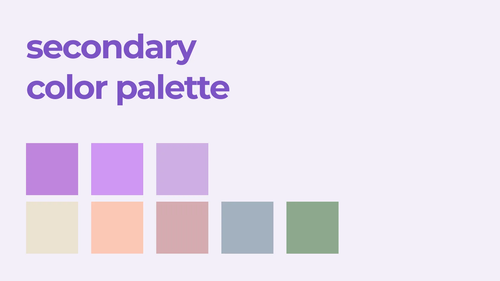
A core palette of purple, lavender and near-black, plus an accent range for the audience categories.
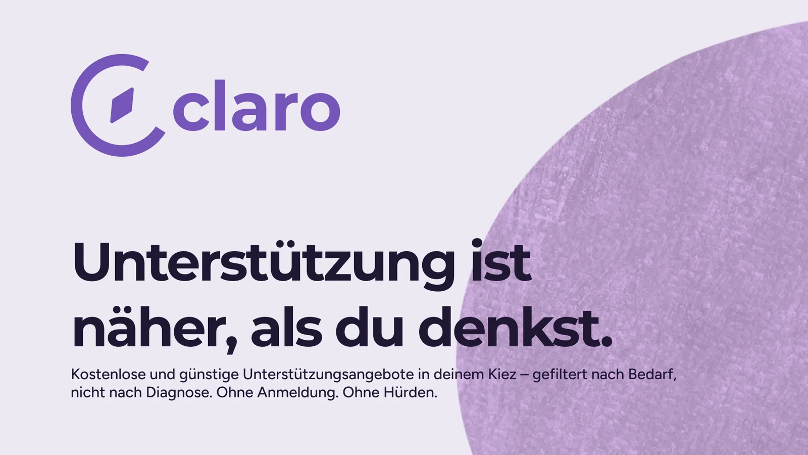
A core palette of purple, lavender and near-black, plus an accent range for the audience categories. Montserrat is for names and headlines and Figtree for body text, both tested with real Claro content, including German characters. Colors optimized for color blindness, fonts optimized for legibility.
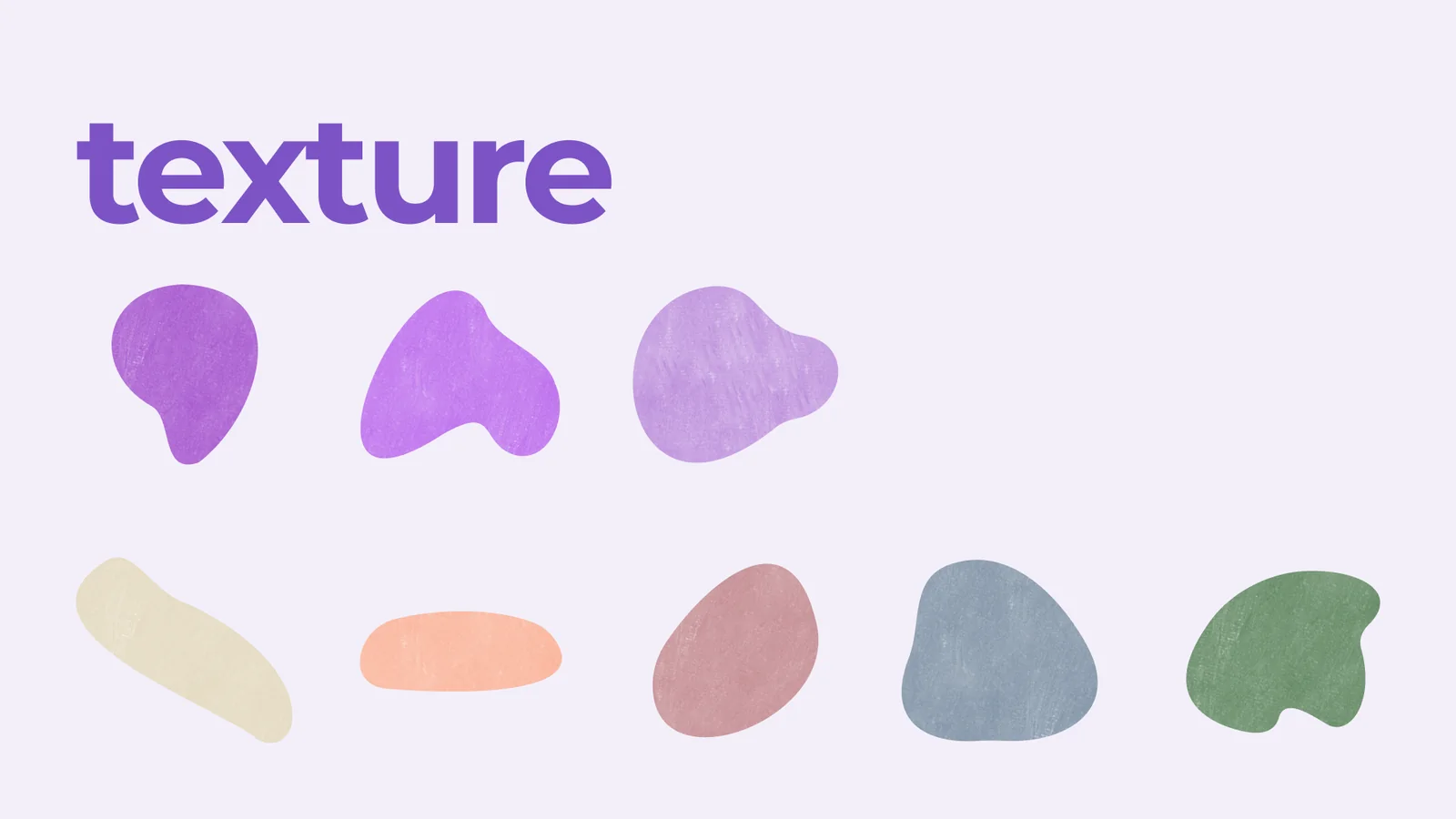
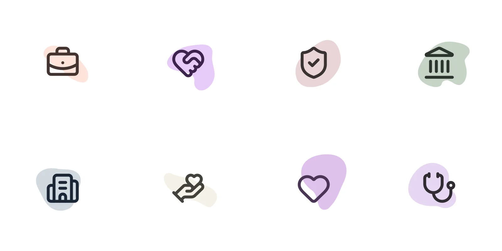
Eight organic shapes, one per audience segment, carry a custom icon treatment built on the same colors instead of an off-the-shelf set. A watercolor and grain texture on the shapes warms up the logo.
Imagery
Grainy and tactile, in line with the textured watercolor blobs.
Grainy and tactile, in line with the textured watercolor blobs. The photos show people interacting with each other or with their environments, not crying in their hands or smiling aggressively. Claro is professional but friendly, not institutional.
The business card
The brief was one card for two founders.
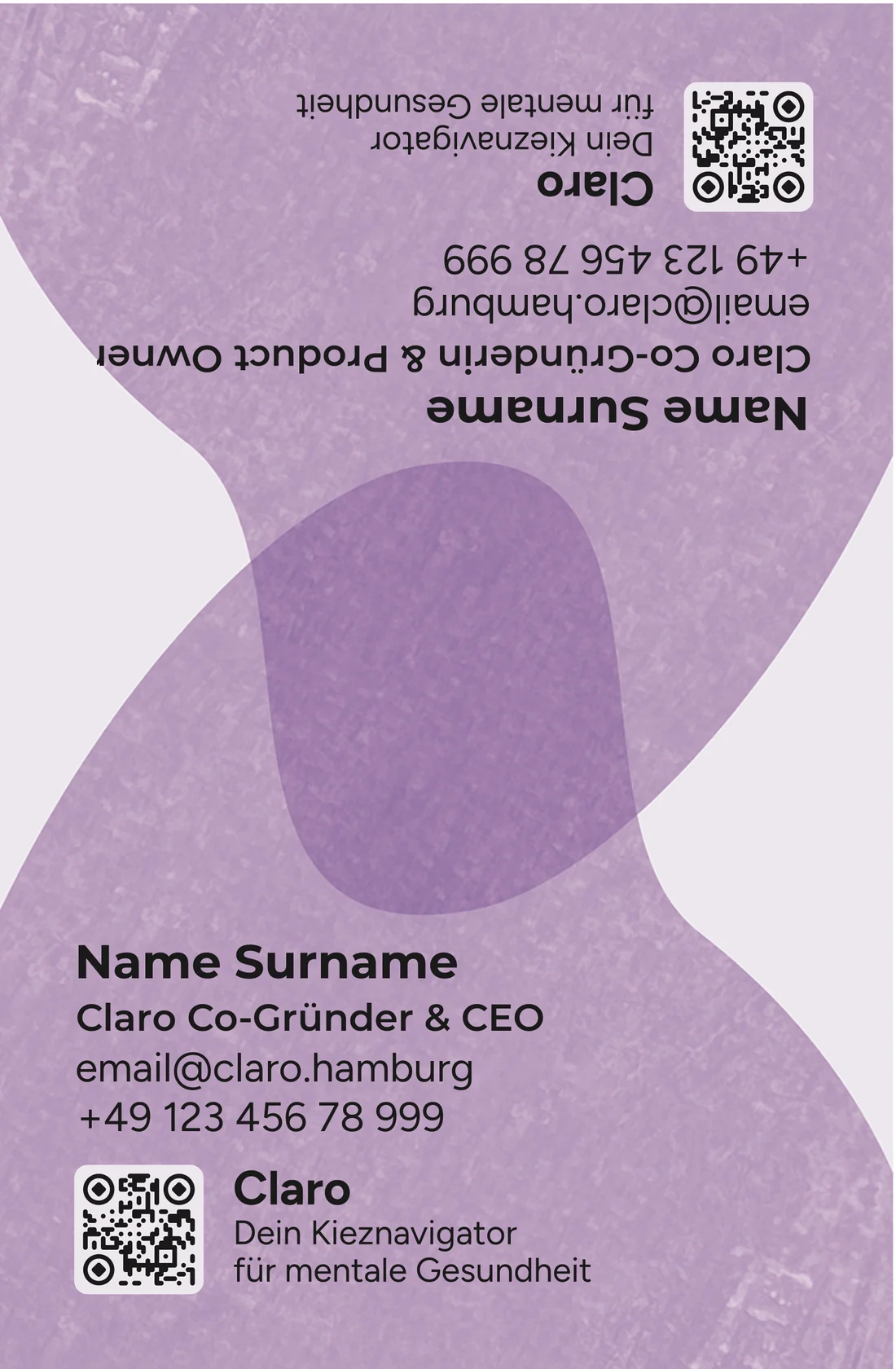
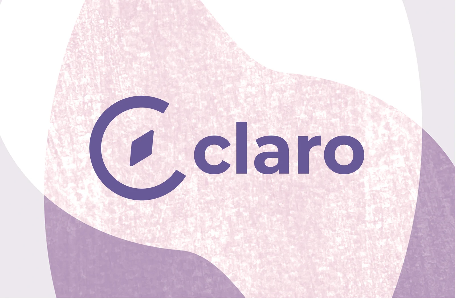
The brief was one card for two founders. The front carries both people, each upright from their own end of the card, joined by overlapping textured blobs. The back carries the logo.
Making it print-ready
The card is 55 × 85 mm and I built it to the print service’s published data rules, then checked it myself: PDF/X-4 with 1 mm bleed, CMYK converted to Coated FOGRA39 with a total ink well under the 300% limit, small text as outlined pure K100 no smaller than 6 pt, and everything at least 4 mm inside the trim.
The card is 55 × 85 mm and I built it to the print service’s published data rules, then checked it myself: PDF/X-4 with 1 mm bleed, CMYK converted to Coated FOGRA39 with a total ink well under the 300% limit, small text as outlined pure K100 no smaller than 6 pt, and everything at least 4 mm inside the trim.
The QR code uses rounded connected modules and ring-and-diamond corners. A nice QR that doesn’t scan is a failure, so I confirmed it decodes at 250, 300, 356 and 600 dpi. Acrobat’s PDF/X-4 check passes on both sides, and a script of mine verifies boxes, output intent, color, resolution, ink and QR decoding.
Website
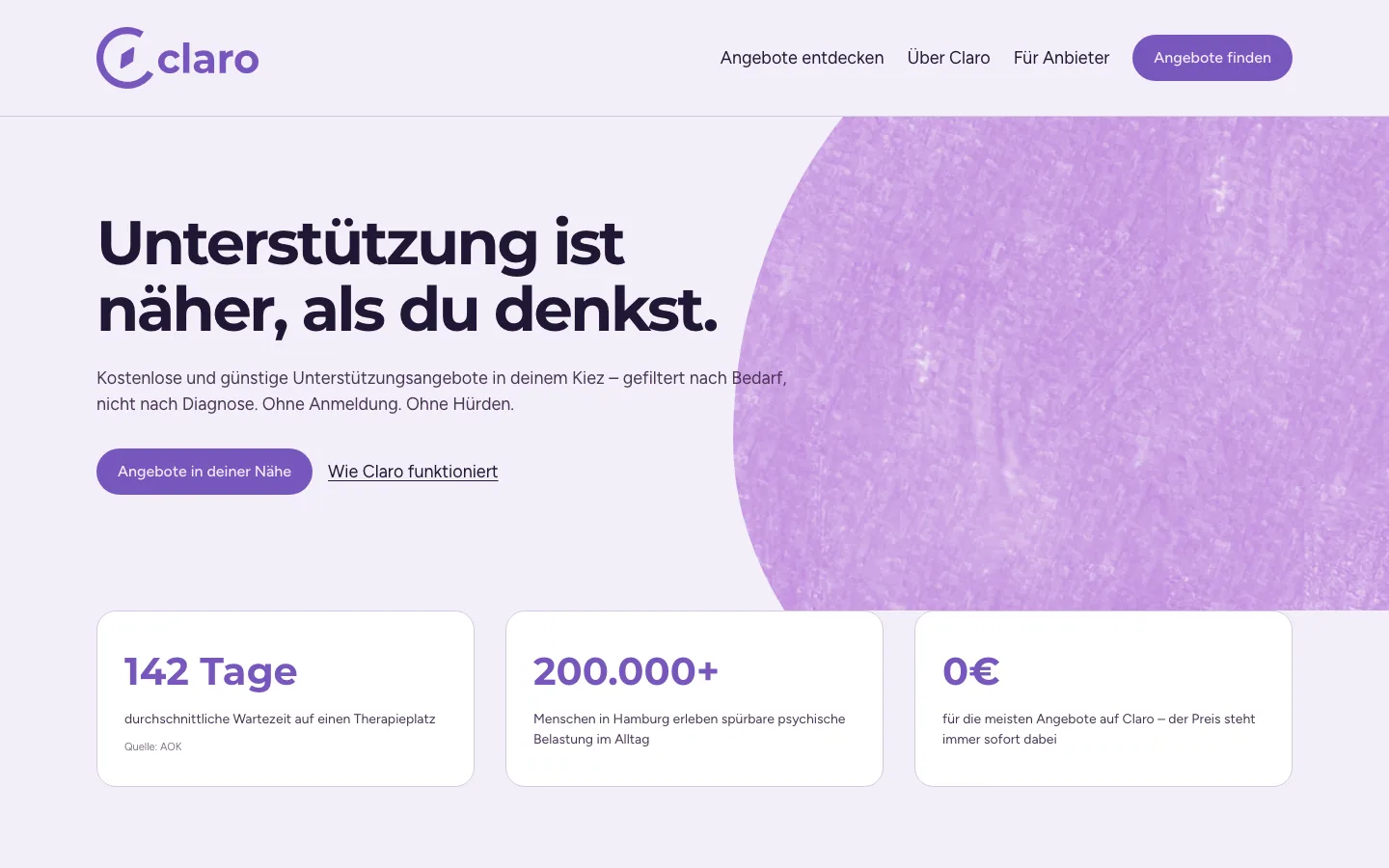
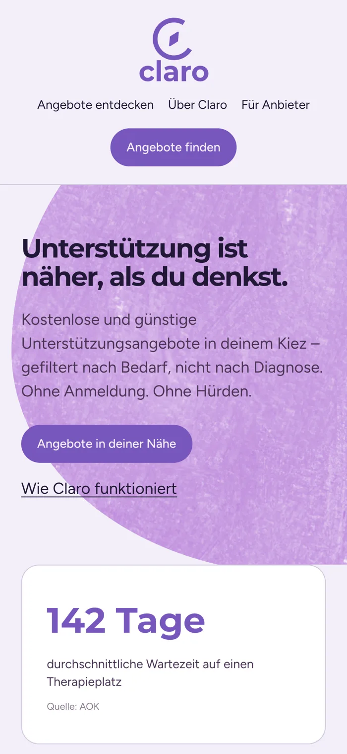
A landing-page styleframe applies the identity to the web: the lockup in the navigation, Montserrat headlines over Figtree body, lavender grounds with textured blobs, and cards that show distance, schedule and price up front.
A landing-page styleframe applies the identity to the web: the lockup in the navigation, Montserrat headlines over Figtree body, lavender grounds with textured blobs, and cards that show distance, schedule and price up front. The copy is plain German and avoids clinical language.