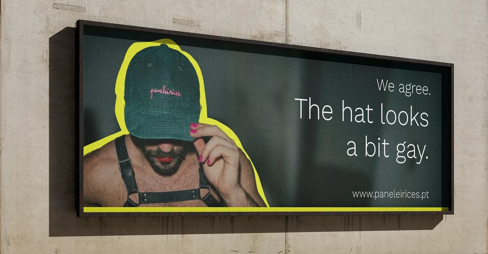
An ad campaign for Paneleirices covering print, digital and outdoor based on misdirection.
The ads
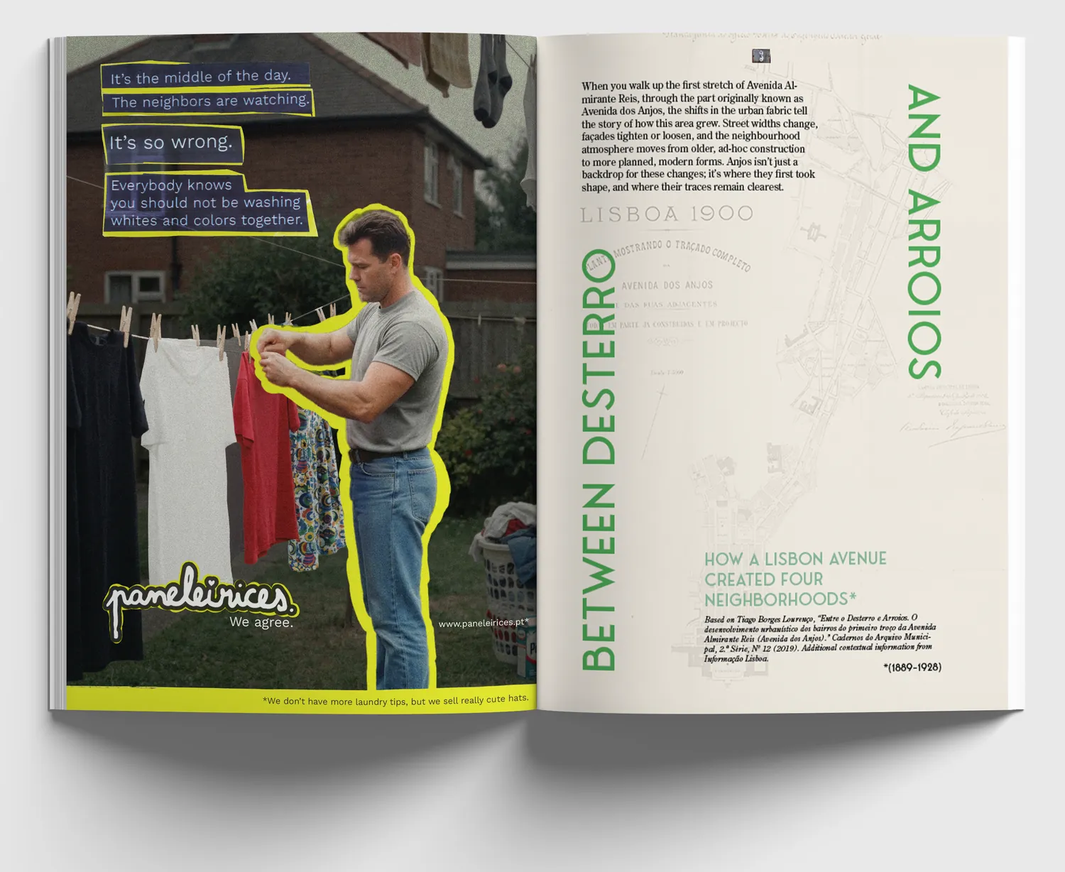
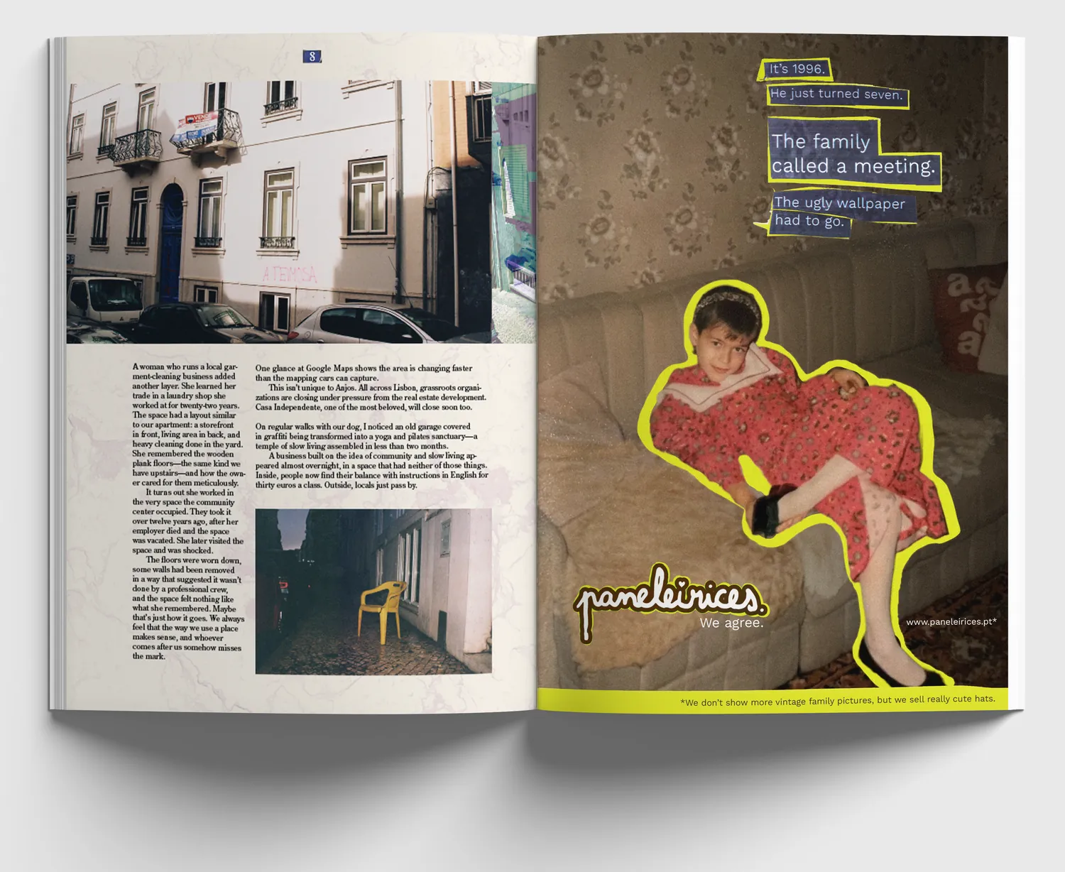
Magazine ad
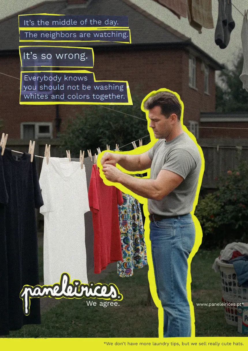
Mupi
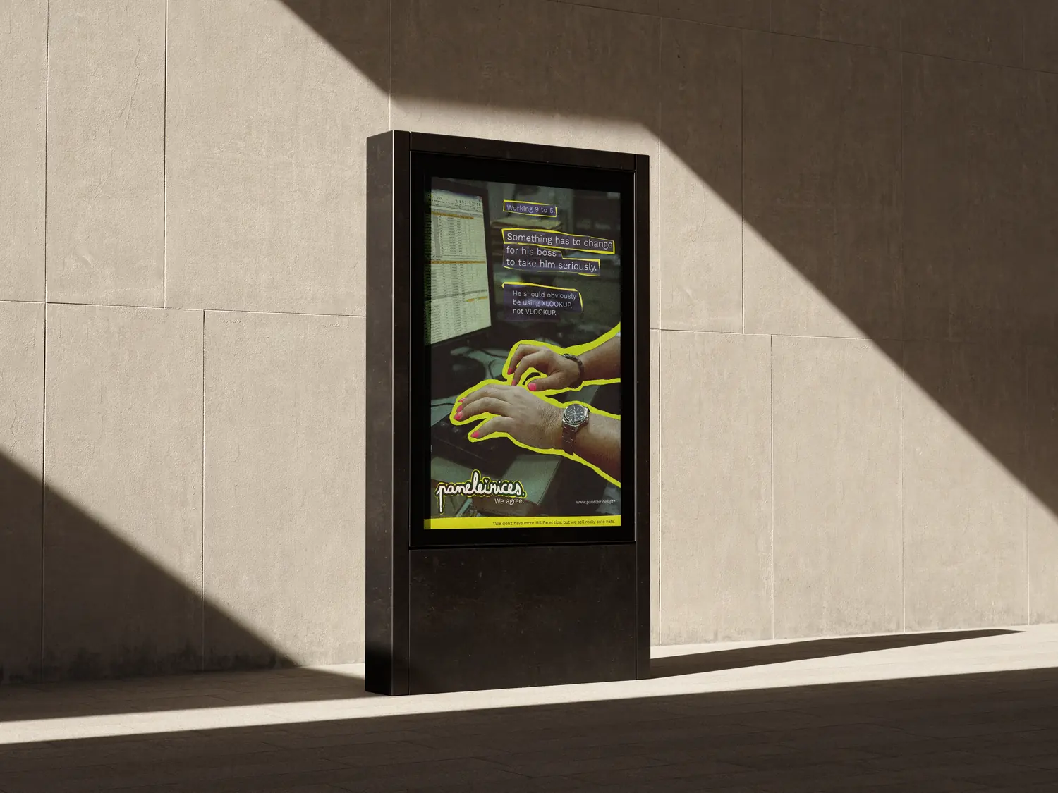
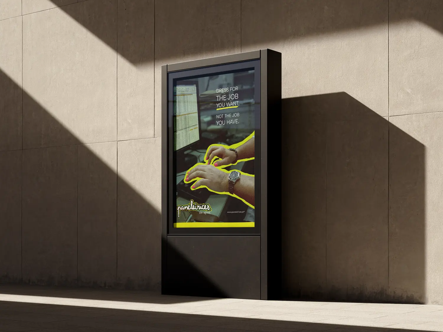
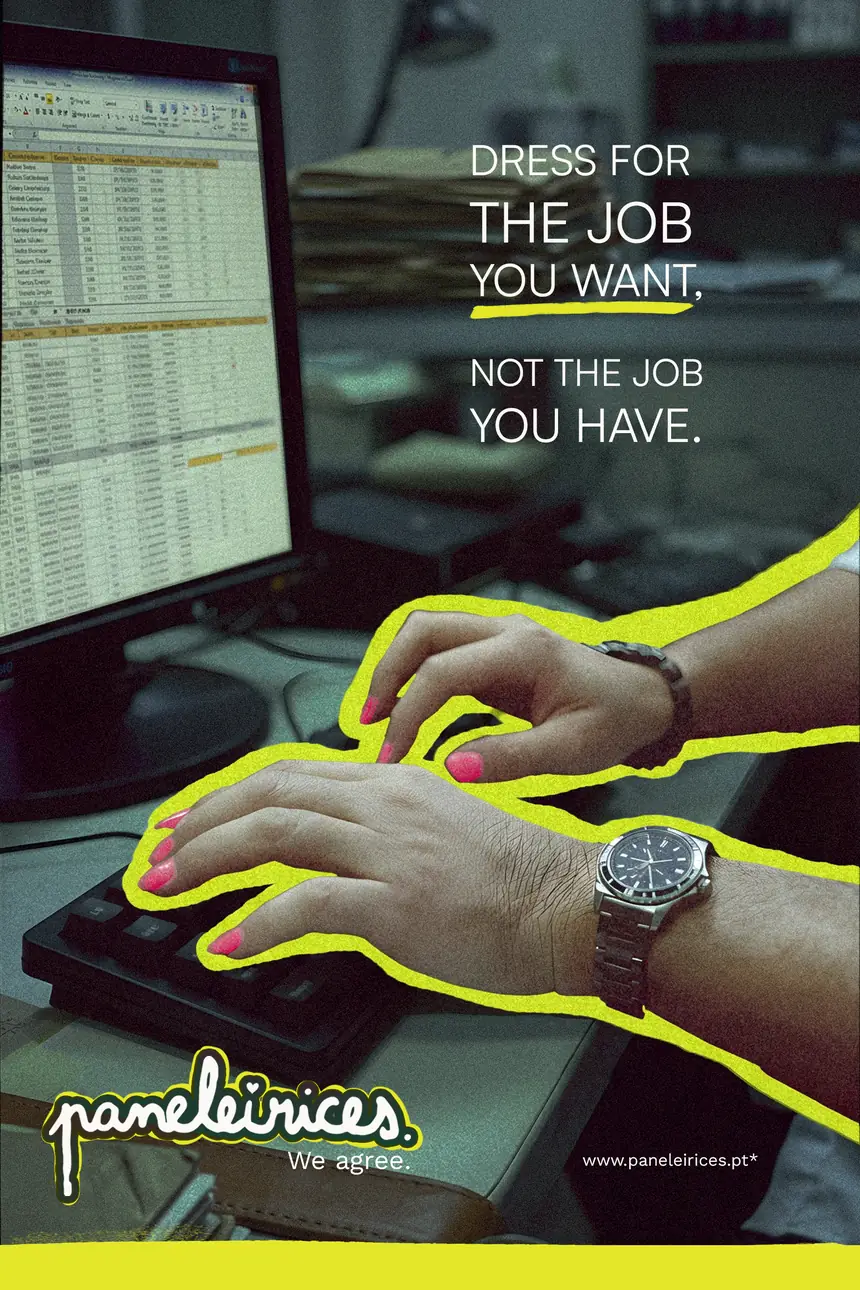
Billboard
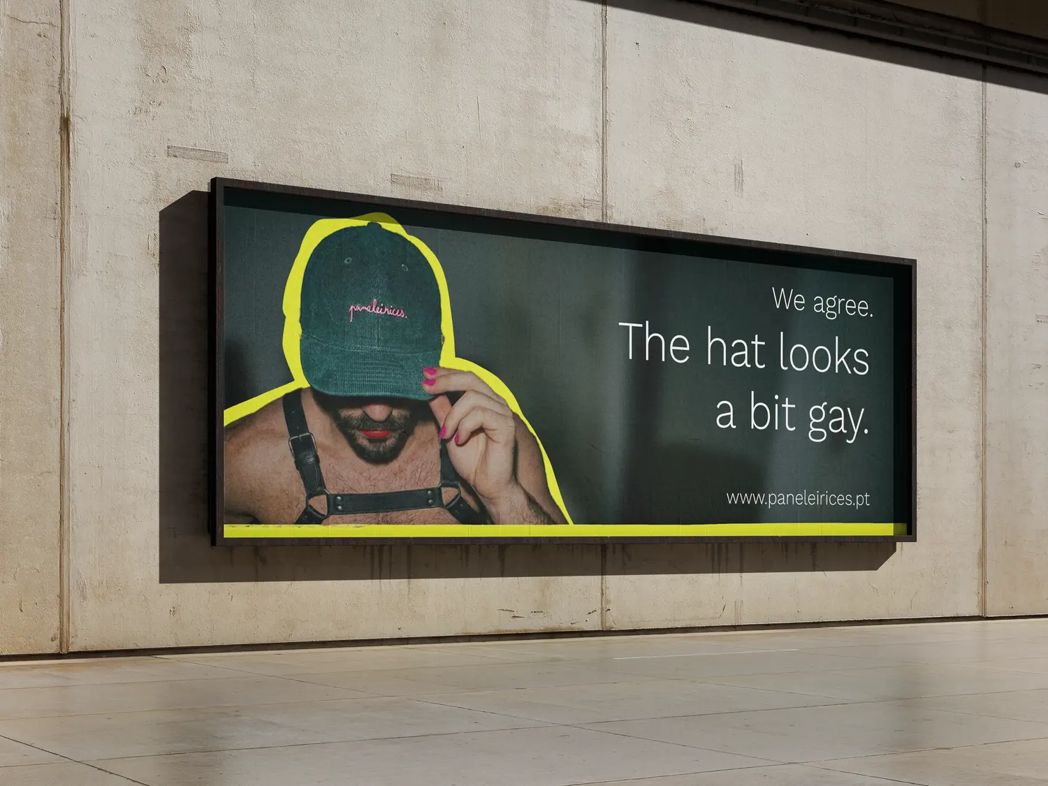
Banner
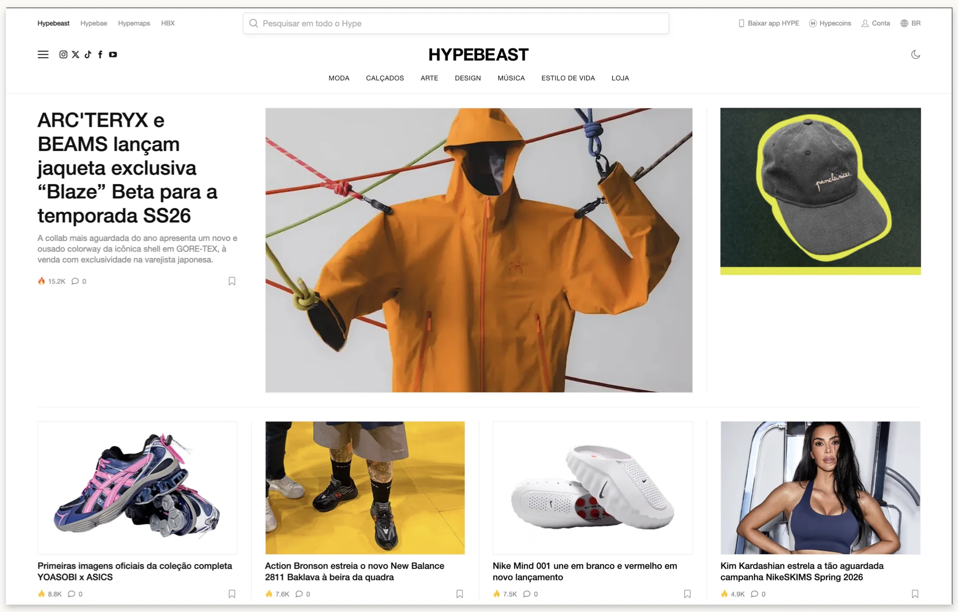

Background
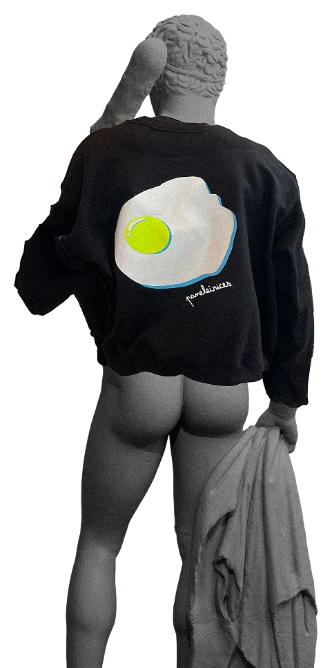
I came into this project with the statue concept from the brand identity already built.
I came into this project with the statue concept from the brand identity already built. It was a safe bet. Classical nudity is socially acceptable, which is exactly why it was never going to provoke anyone.
My teacher pointed out that social media is full of statues and statue mashups, and he tattoos them a lot himself, so he knows a cliché when he sees one. I treat every teacher as a client, so I took the note, dropped the statues and started over.
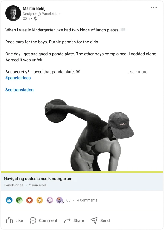
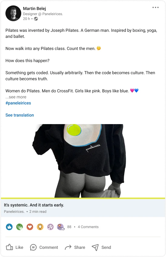
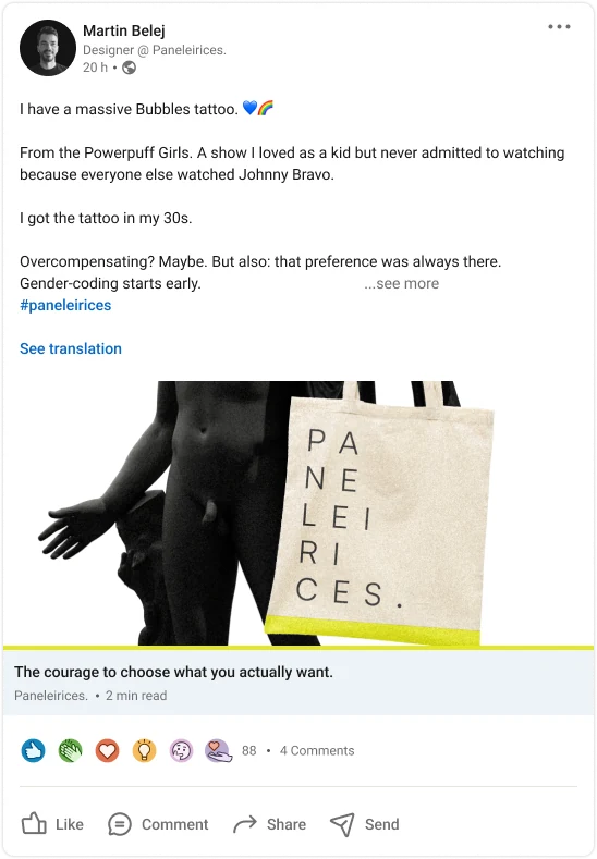
The second idea was about social conventions: thought-provoking posts for LinkedIn, picked because it’s the worst possible platform for Paneleirices. Then it clicked.
The attitude
The brand is kind of a fuck you.
The brand is kind of a fuck you. It’s supposed to be unapologetic, so I went looking at provocative ads: old Benetton, Diesel and Sisley. They can be sensual and suggestive, they make you feel things, and they use crude flash photography. I wanted to get to that feeling, at least.
The photo
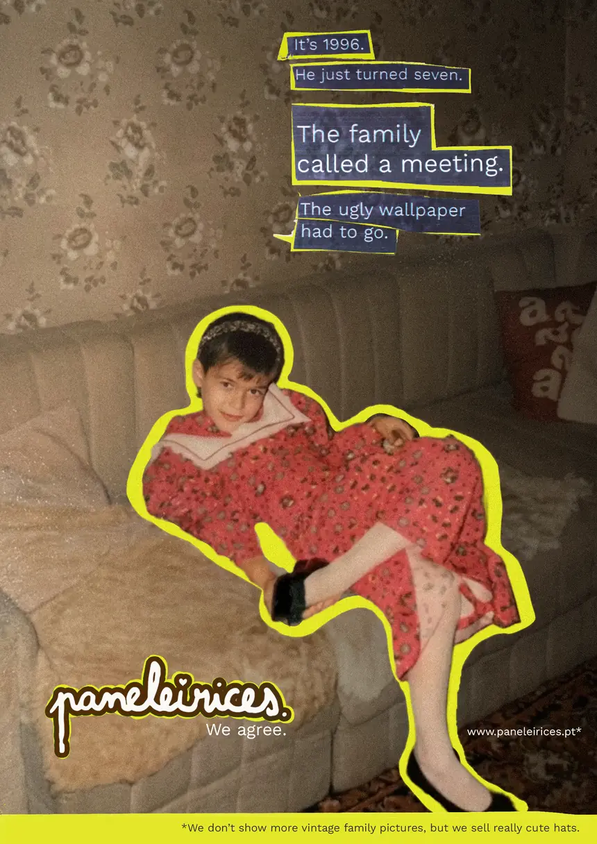
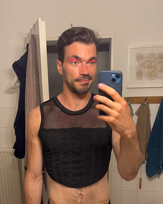
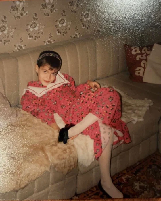
What clicked was a childhood photo of me in a dress.
What clicked was a childhood photo of me in a dress. Paneleirices is for someone who doesn’t give a fuck because he can’t be bothered to be anything other than what he is. It’s for the kid before he was told he isn’t supposed to like this or that. He tried not liking it, and now he’s like: fuck you, I’ll just do me, because anything else costs too much.
It’s a metaphor for being gay, but it applies to anything you suppress.
“Wearing it means choosing the thing you’re not supposed to want. Again.”
From an earlier draft
Misdirection
It works like this.
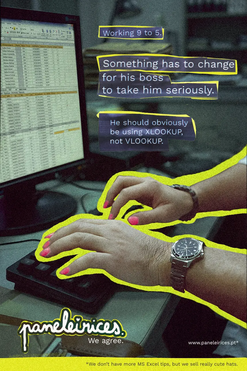
It works like this. I present a situation and make a harsh statement, which invites you to project your own biases, or other people’s. Then comes the punchline: I meant something completely irrelevant all along, like a wallpaper or an Excel function.
Not all of them work on a general audience. But where people are interested, they look things up. The Excel posters would go near offices and in metro stations, where people have time to read them while they wait. I also made a B variant for an A/B test, using the quick cliché of dressing for the job you want.
Early feedback asked whether the language was too shocking, and whether it could be more misleading, so it isn’t clearly ironic from the start. It also asked for a bigger logo, a tagline and better type. The tagline became We agree.
Social
The stories use the clichés: boys will be boys, it’s a man’s world, happy wife, happy life.The stories use the clichés: boys will be boys, it’s a man’s world, happy wife, happy life. People have short attention spans, and a cliché cuts to the chase faster. The posts are slower. One uses another childhood photo of mine with a long caption, and the crying boy gets a short one. Two lengths, so I could test what works.