Paneleirices is confident and unapologetic. Polished enough to pass for a luxury brand, unless you get hung up in the name.
The name
Paneleirices is a Portuguese word that sounds elegant until you know what it means.
Paneleirices is a Portuguese word that sounds elegant until you know .
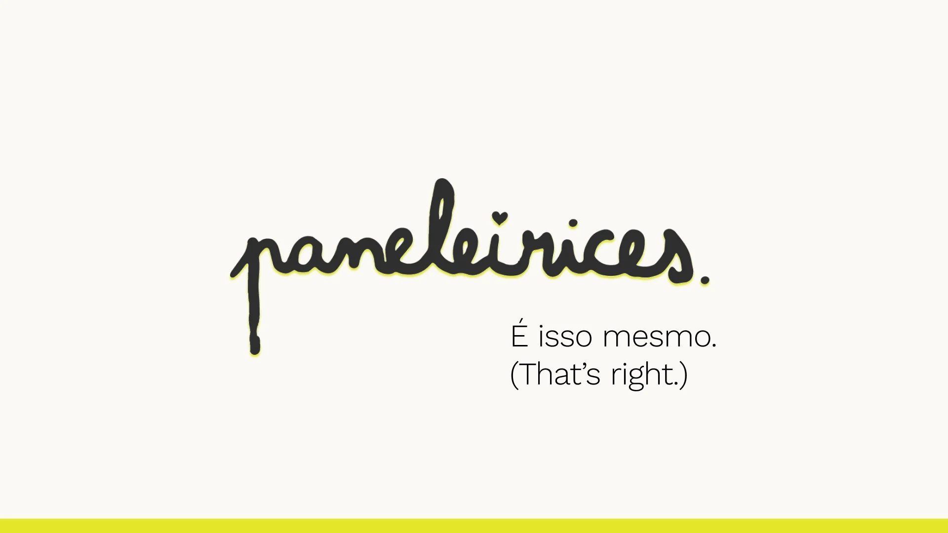
The claim is É isso mesmo. It means “That’s right.” I wanted something short that answers the reader before they can object: yes, that’s what it says. My professor suggested “Why not?”, which was close, but it asks permission. This doesn’t.
The why
Paneleirices is for anyone who has ever been told they were “too much” and should tone it down.
Paneleirices is for anyone who has ever been told they were “too much” and should tone it down. It takes the word that was used to shame and wears it on purpose, with ownership and quiet confidence. Social pressure to tone down, reclaiming language used to shame, doubling down because not doing so isn’t an option.
It’s about being ballsy and doubling down on whatever it is that you are or what you like. Because sometimes you don’t have other options than to double down. Except living with the shame of not doubling down, which is not really an option.
My teacher’s advice was to make the brand look polished, not DIY, because polish makes the word more shocking. So everything around the word is restrained, and the word does the shouting.
The mark
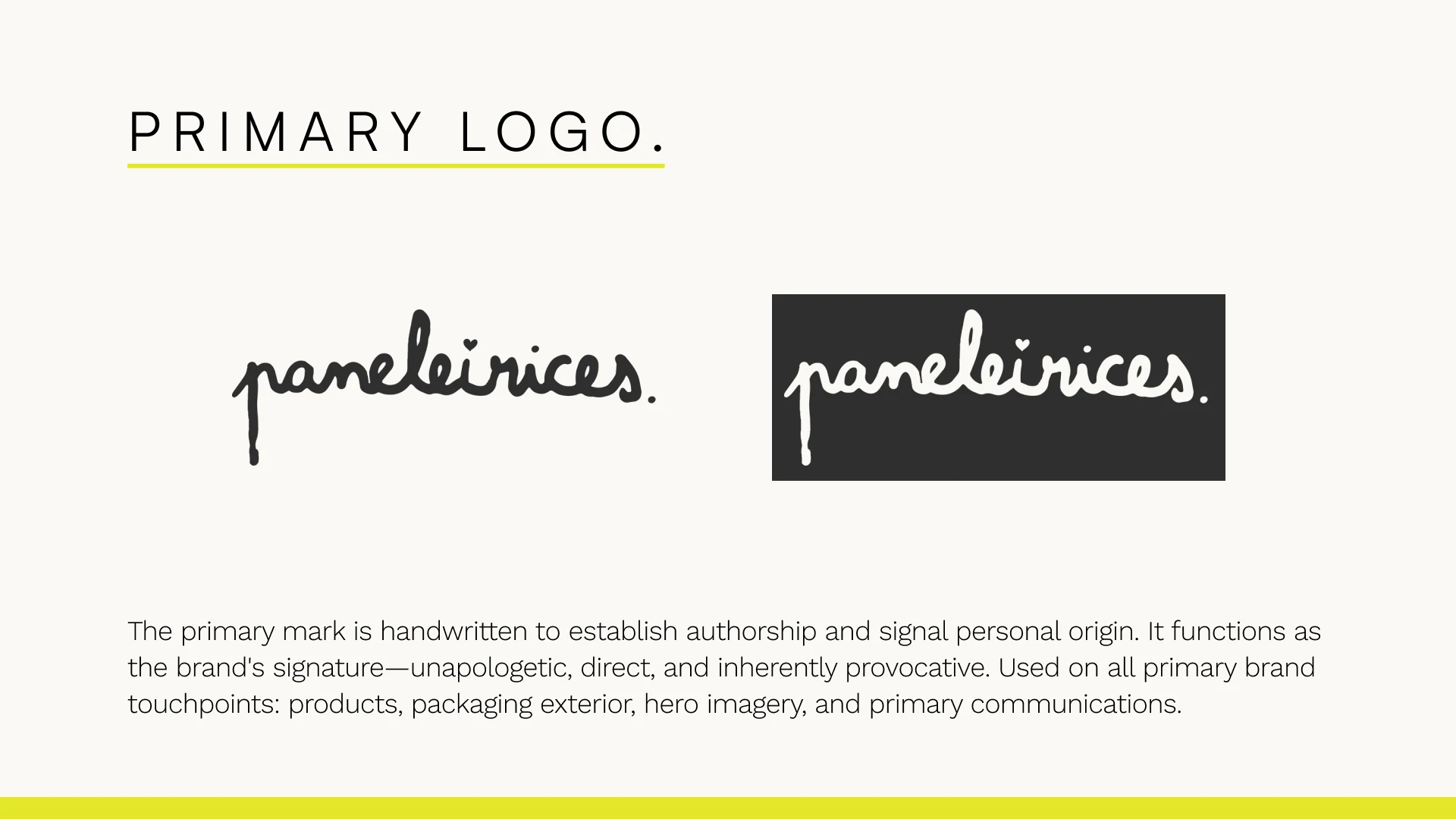
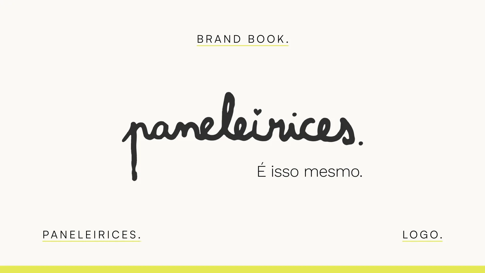
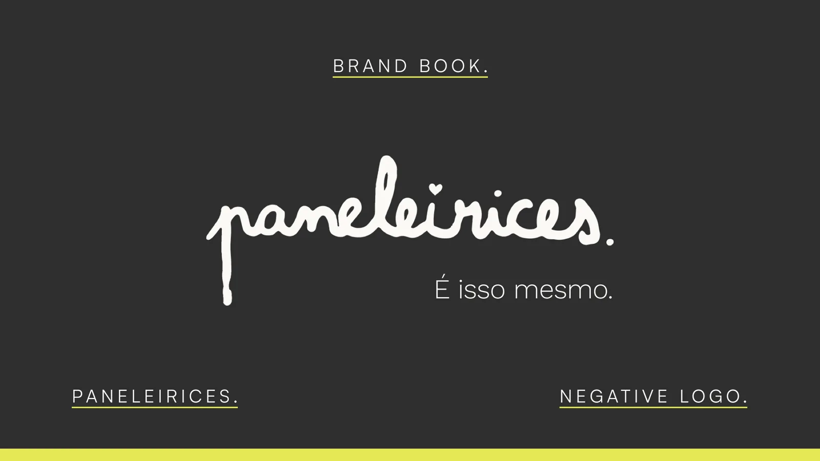
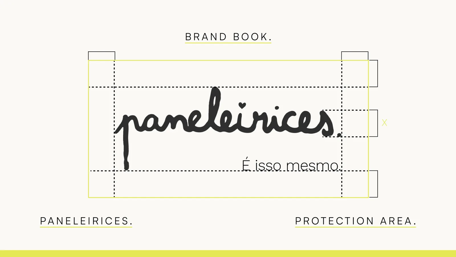
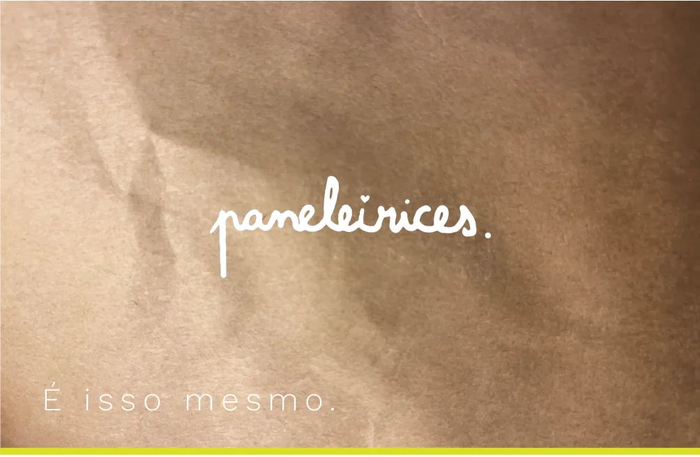
The handwritten mark is the main logo.
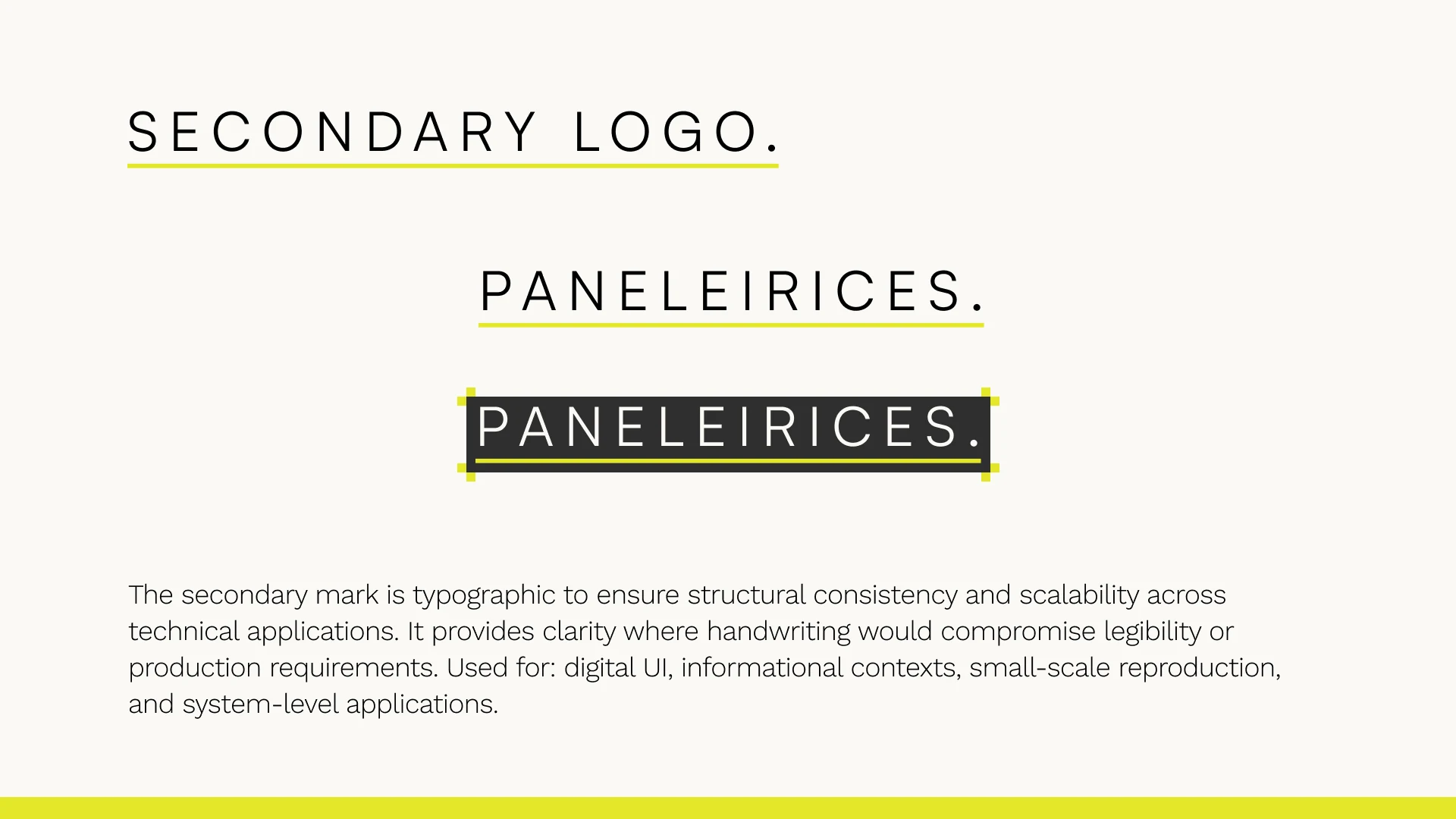
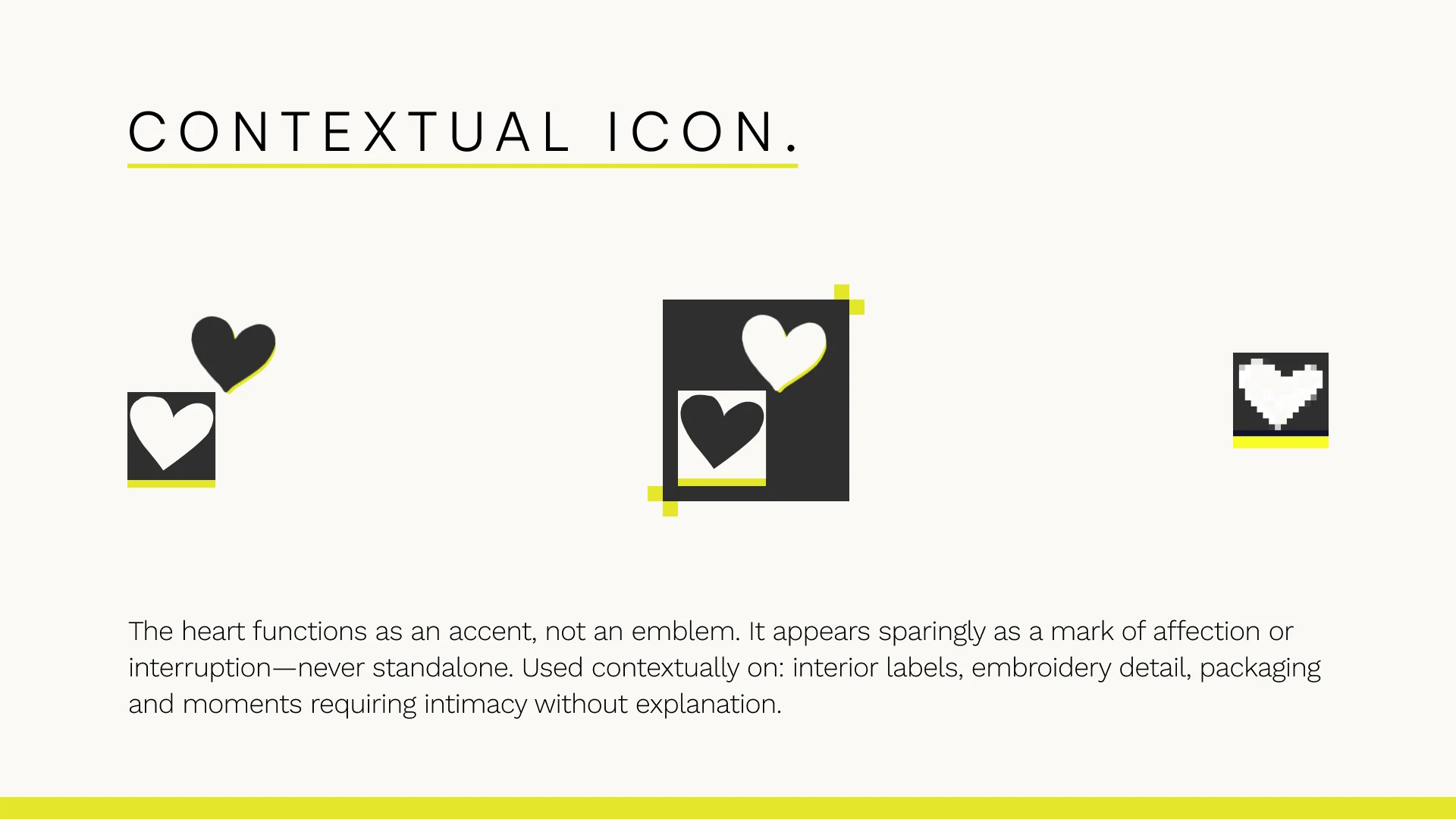
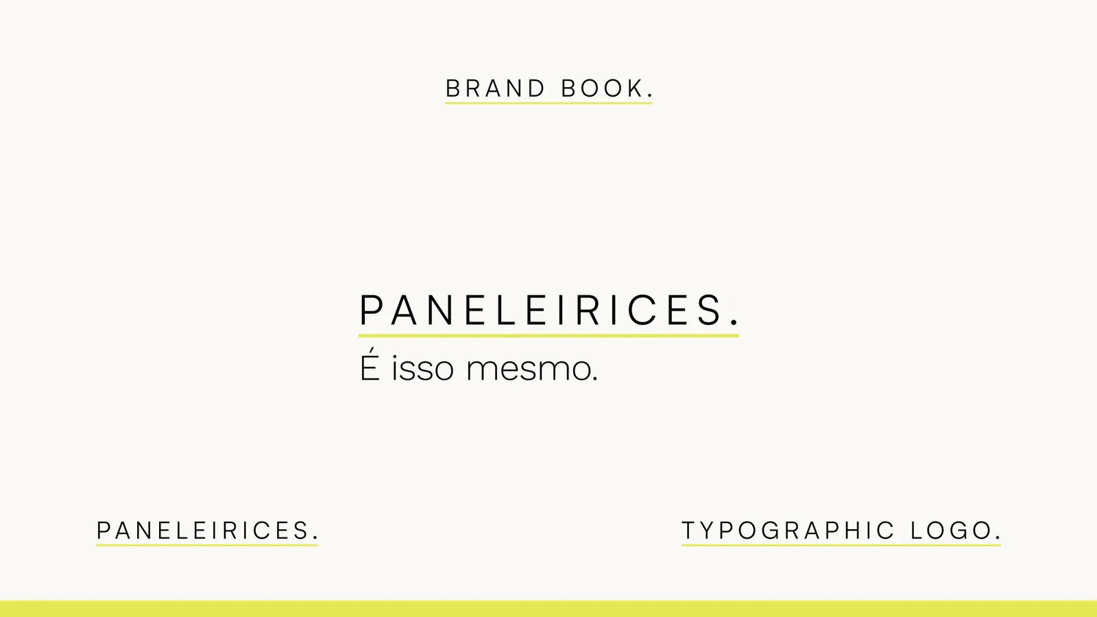
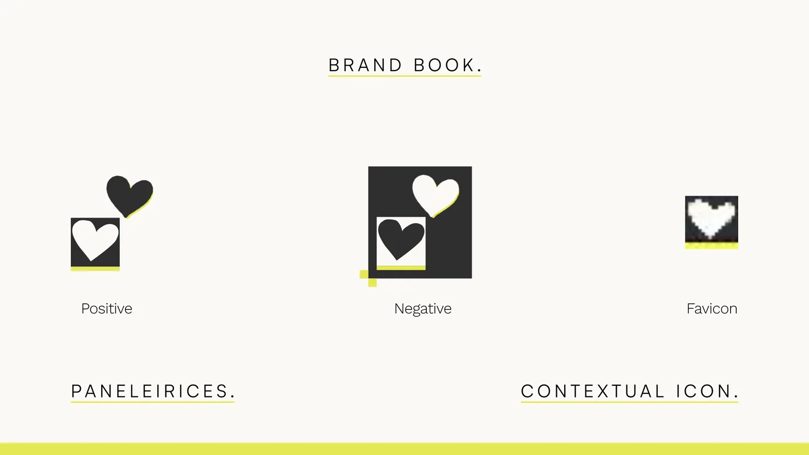
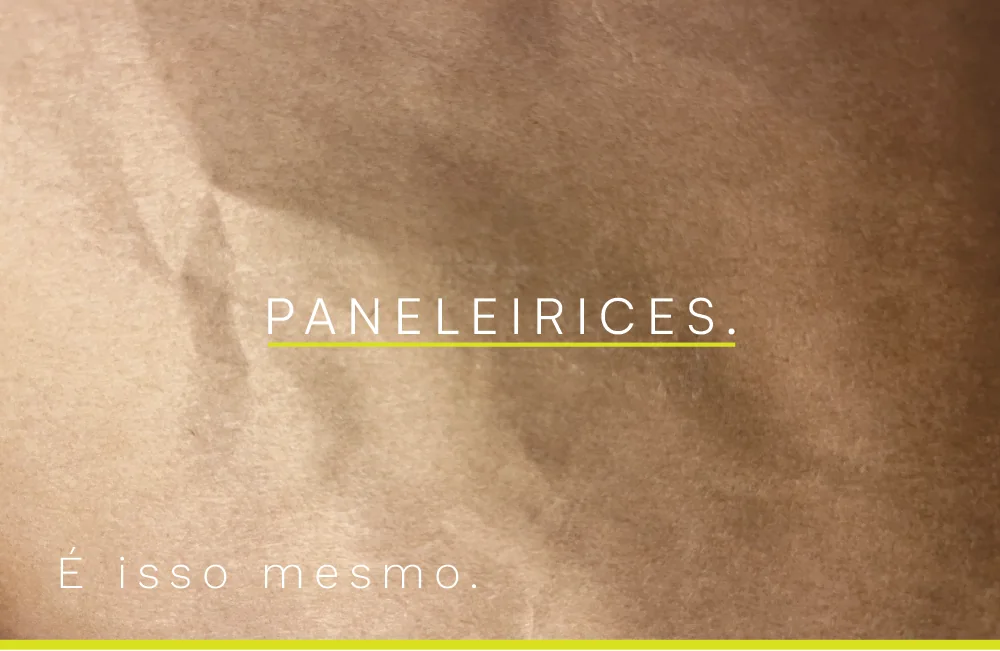
The handwritten mark is the main logo. It reads as a signature: direct, unapologetic, a bit cute. A typed version steps in where handwriting would hurt legibility, like small sizes and digital. The heart is only ever a small accent, never a logo on its own.
It didn’t start that way. In my first presentation the typed logo was the main one and the handwritten mark sat third. Classmates and another teacher reacted most strongly to the handwritten one, and he asked why it was only the tertiary logo. I had no answer. I think I had been using the hand-drawn version to make the word cute and palatable. I want it to be confident.
Getting there meant taking things away. I tried a heart on an i, which looked too much like Comme des Garçons and AMI Paris. I tried gradients, one of them very Facebook, and a louder yellow that was too aggressive. What survived is a restricted palette, a signature, a clean typed version for structure, and the heart as an accent.
The system
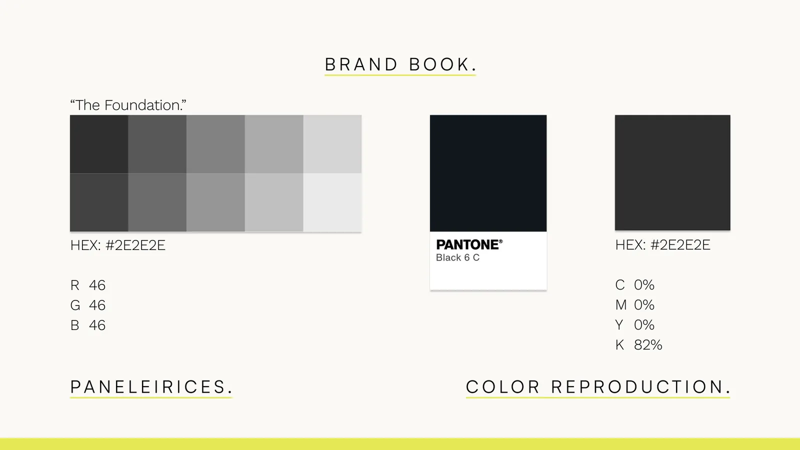
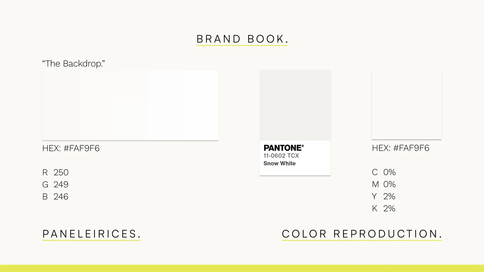
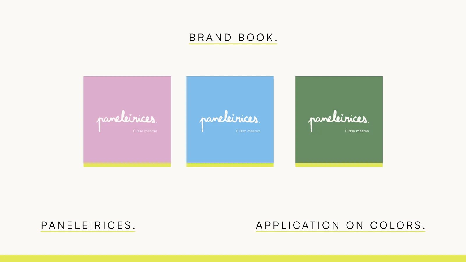
Three colors, each with a name.
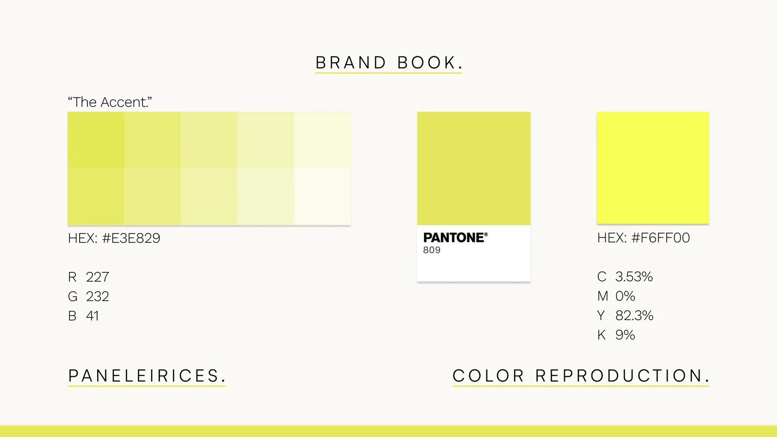
Three colors, each with a name. The Foundation is a near-black, #2E2E2E. The Backdrop is a warm off-white, #FAF9F6. The Accent is a neon yellow, #E3E829, and it’s only ever an accent: a stripe, an outline, a rule under a word. On screen that’s Pantone 809 C. In print, #F6FF00 matches it best, because #E3E829 goes dull on paper.
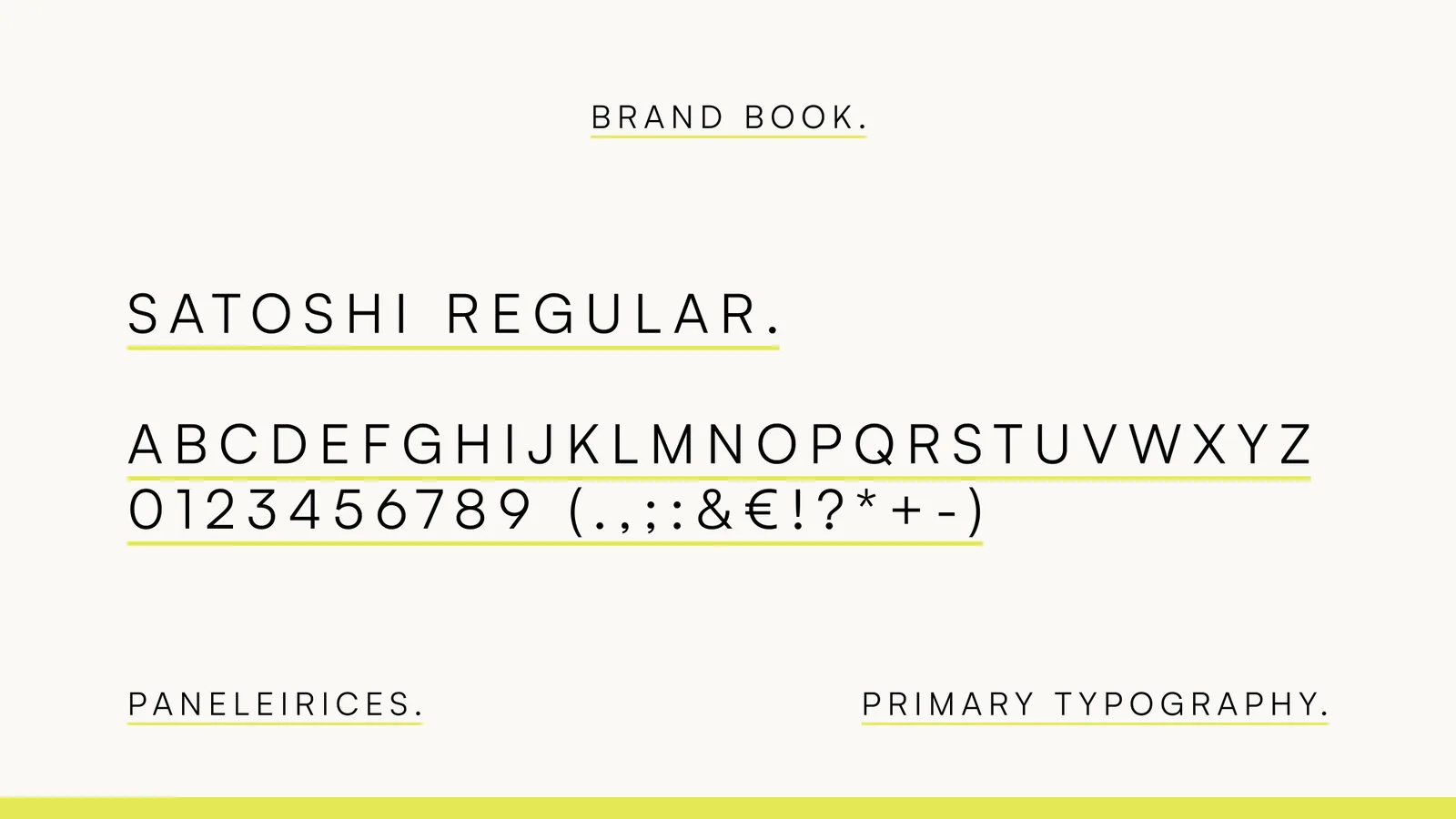
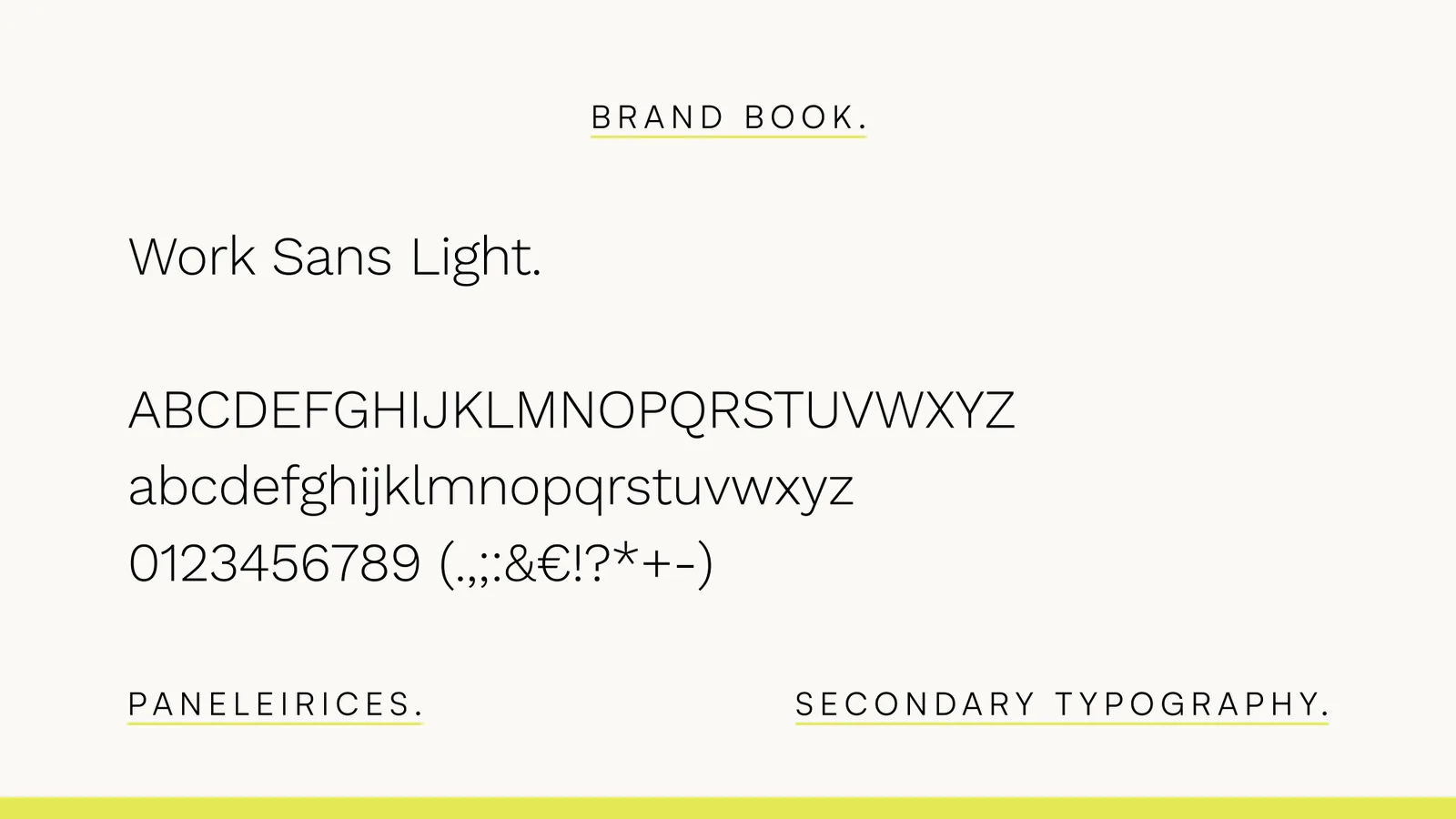
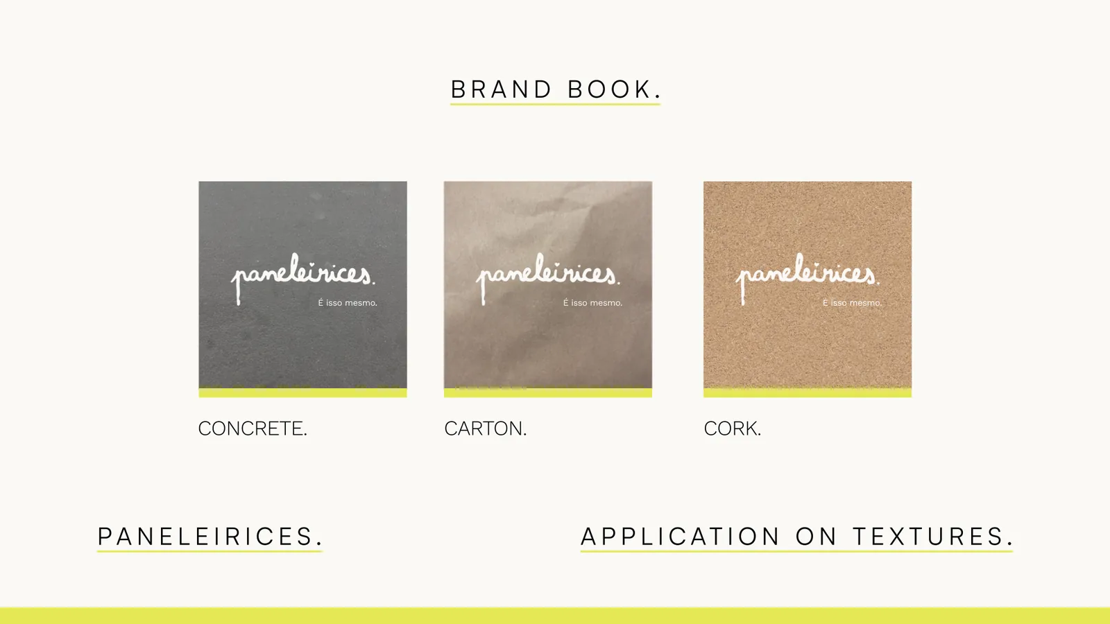
The type is Satoshi for the brand and Work Sans Light for everything that has to be read. Both are free to use. The materials are concrete, carton and cork.
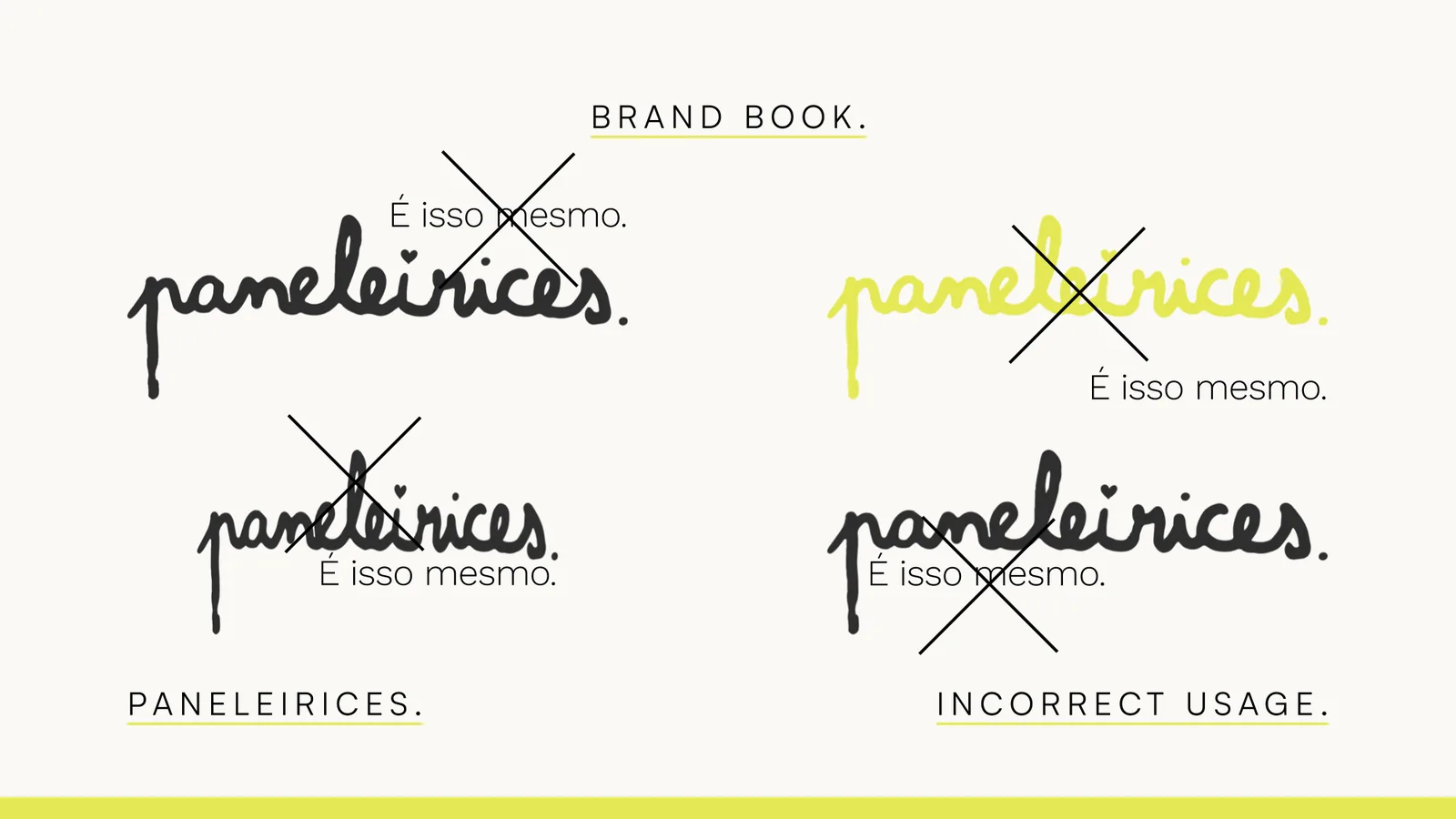
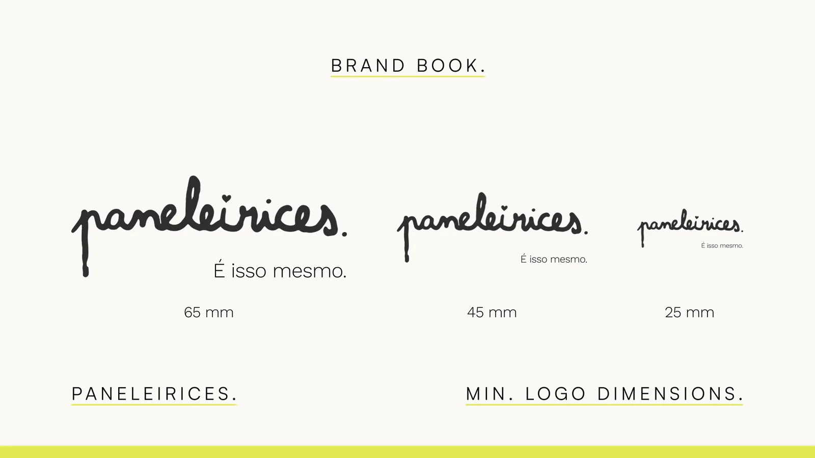
The brand book has the rest: protection area, minimum sizes, what not to do, and how the logo sits on images, colors and textures.
The imagery
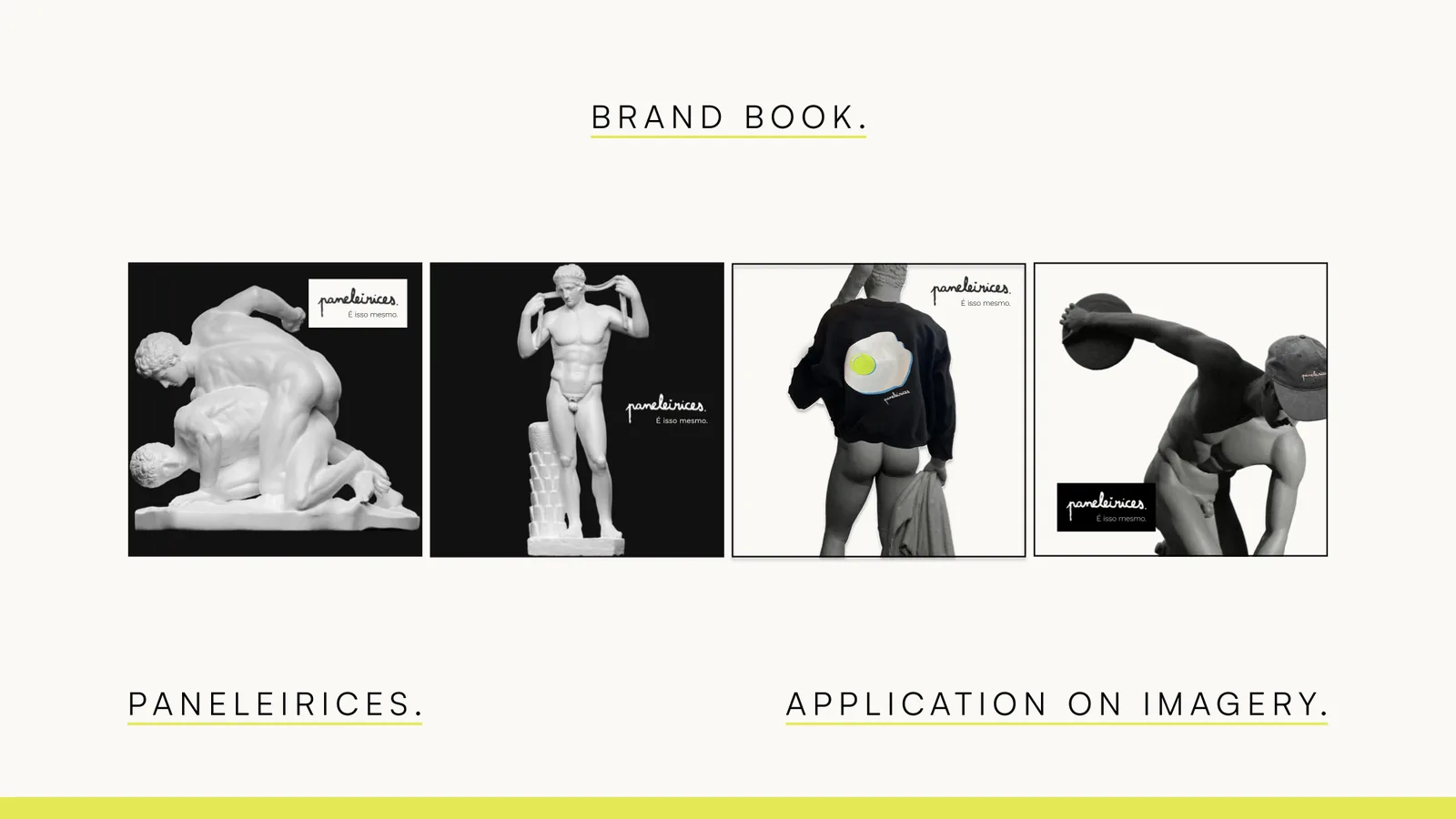
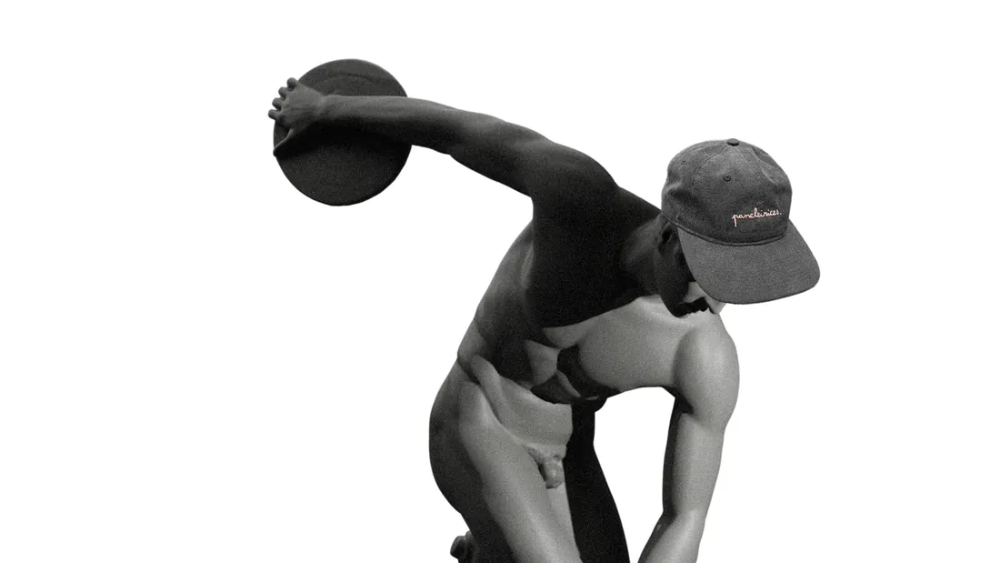
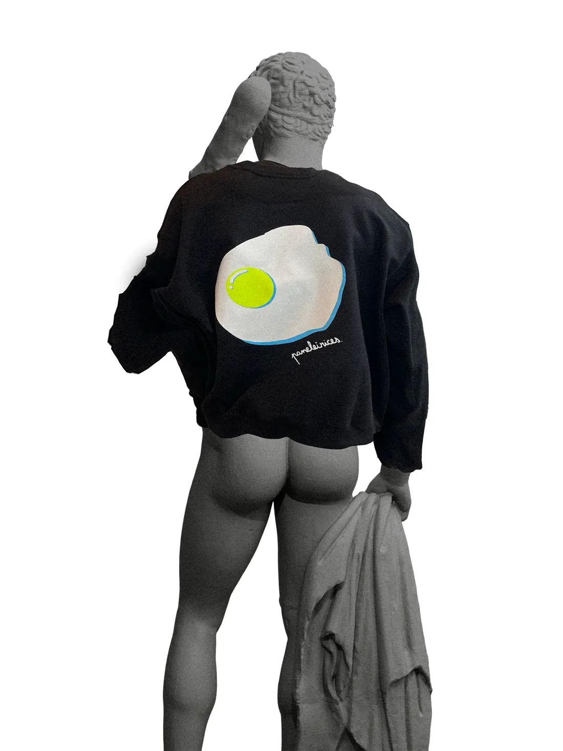
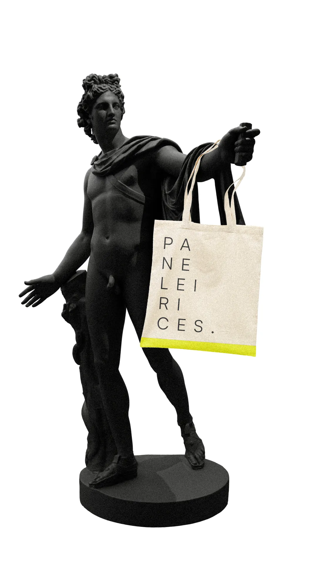
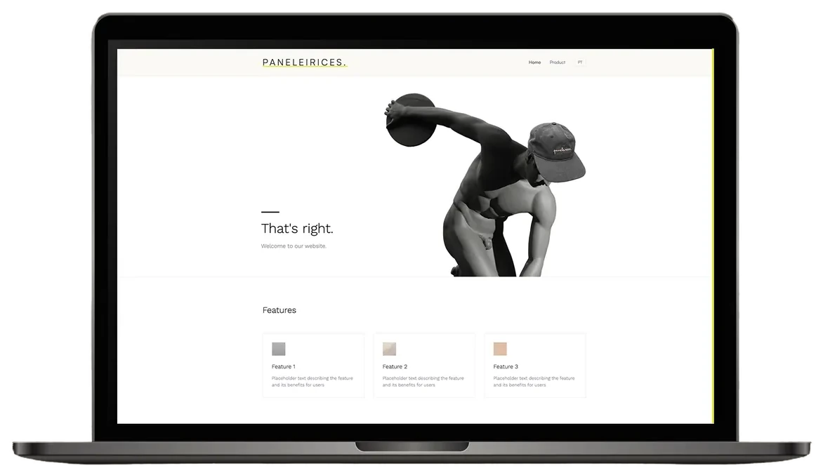
For the imagery I used 3D models of antique statues from the SMK Open collection, styled as though they wore the products, with the accent color as an outline.
For the imagery I used 3D models of antique statues from the SMK Open collection, styled as though they wore the products, with the accent color as an outline. The models are free to use, take brand materials easily, and classical nudity is widely accepted as craftsmanship, which neutralizes the shock.
It was the first imagery idea. The ad campaign later moved on from it; the story is on the Advertising page.
Applications
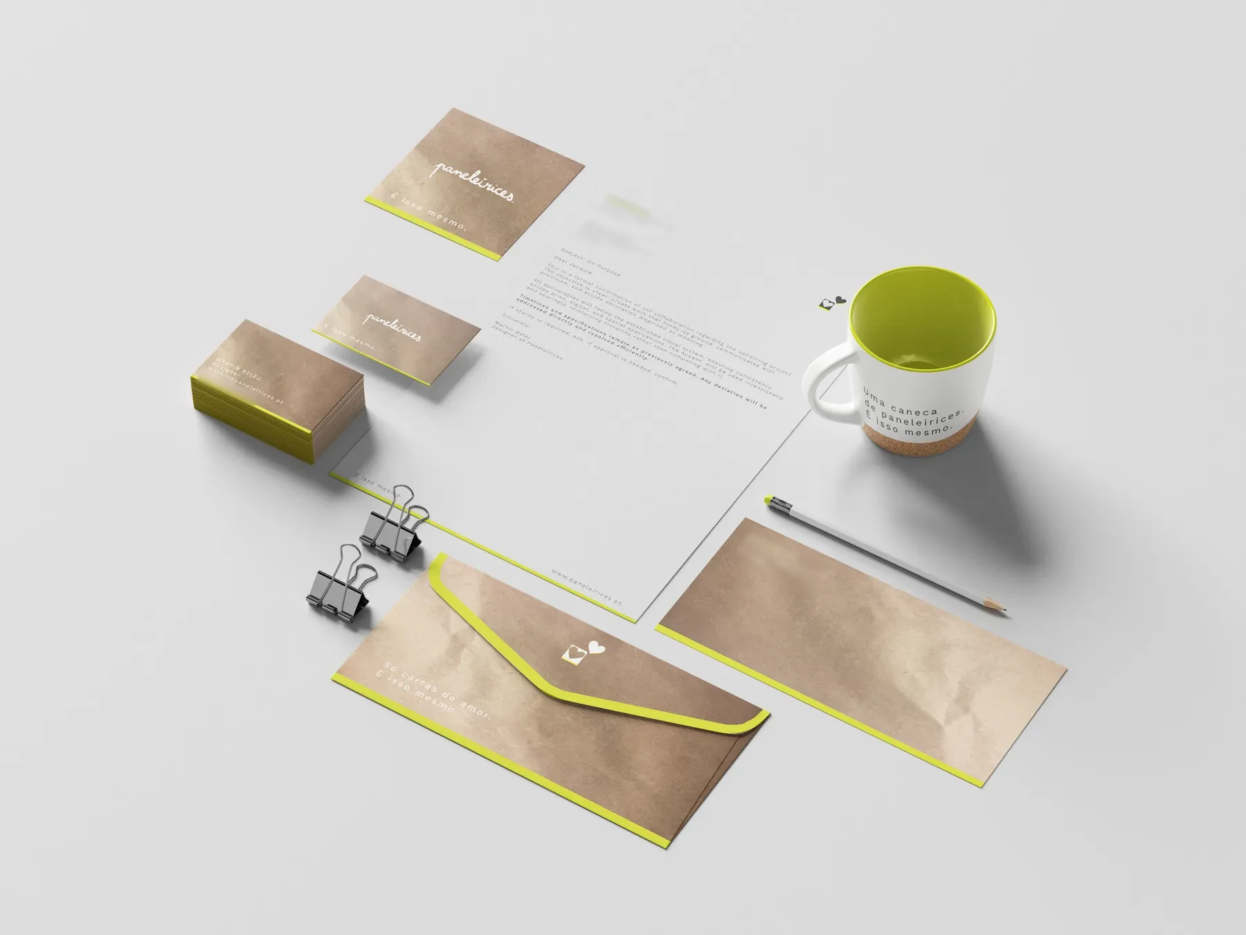
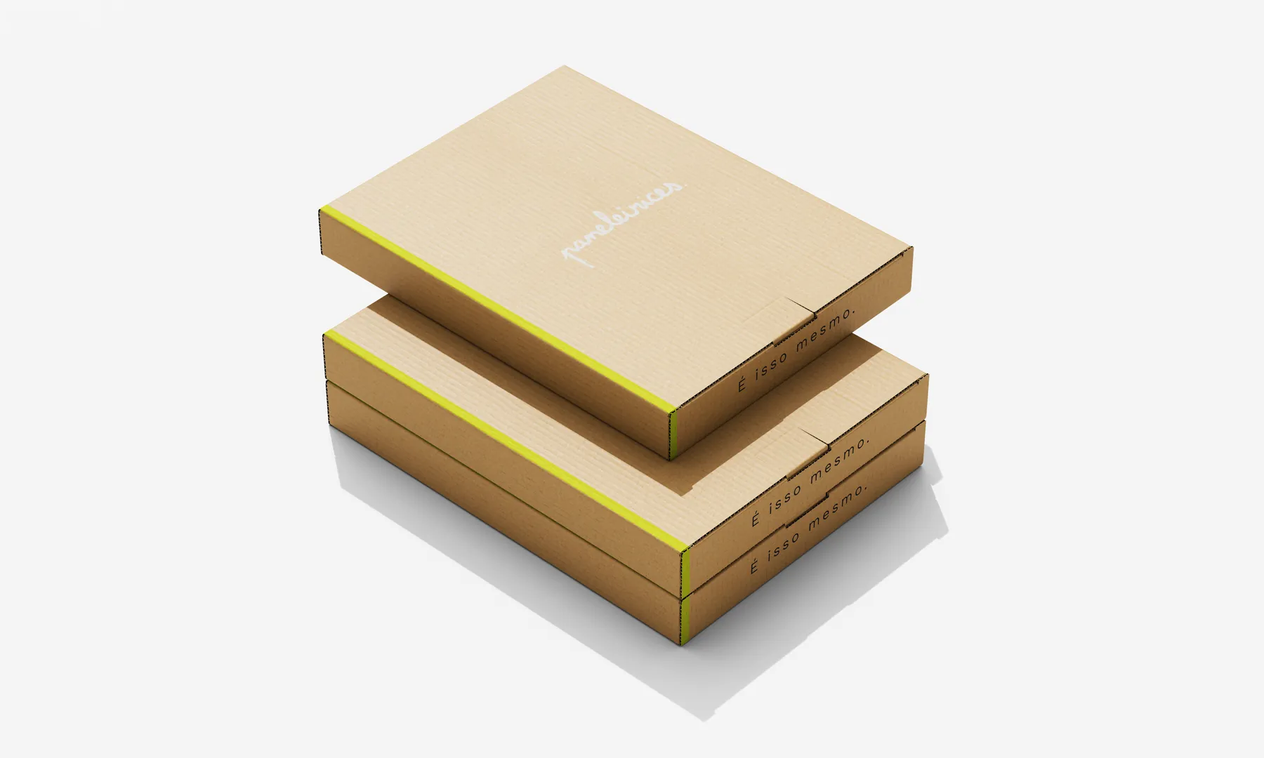
Everything is kraft, off-white and black, with one neon line.
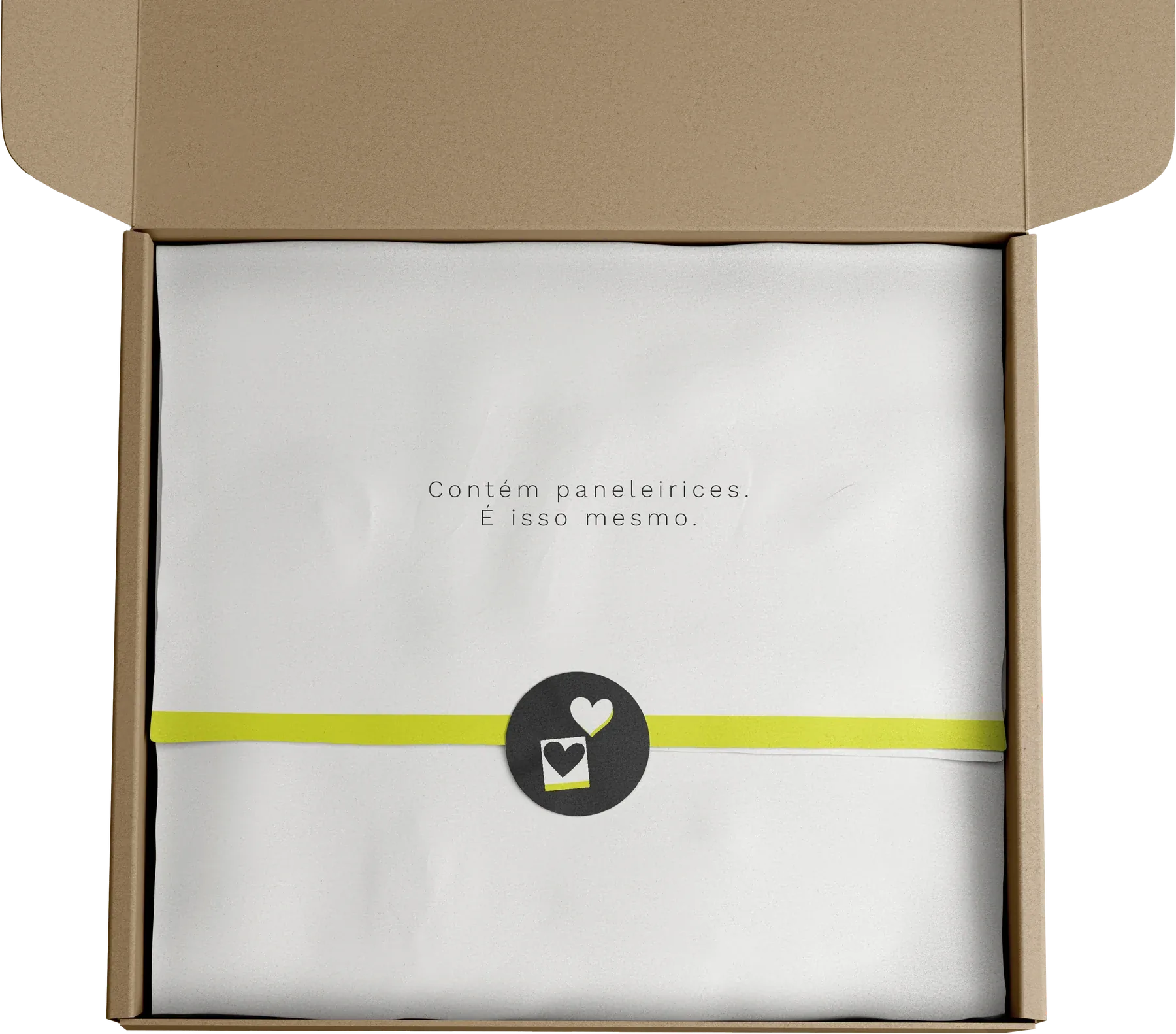
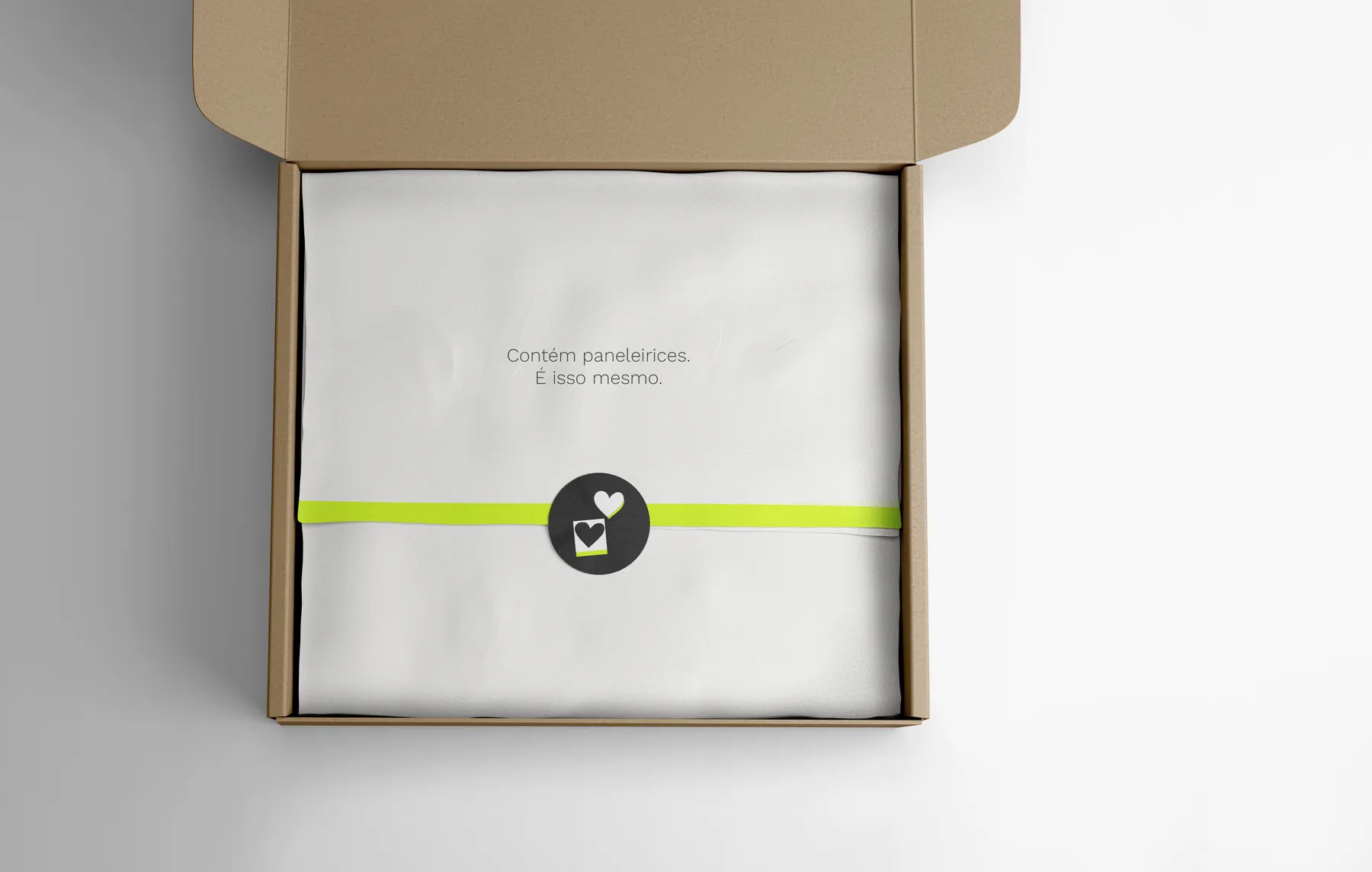
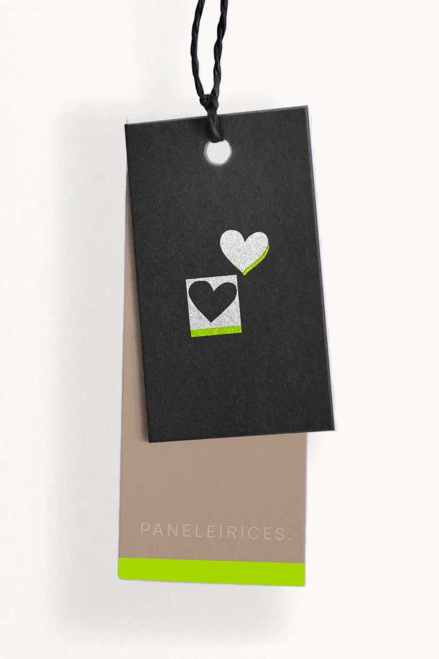
Everything is kraft, off-white and black, with one neon line. A business card, an envelope, a letterhead, a hang tag, a woven label, a shipping box, and tissue paper that says Contém paneleirices. É isso mesmo. The heart turns up on the inside, as a small private gesture.
Stationery
Packaging
Labels
Digital
The response
After my presentation a classmate bought the hat and said the brand had “fuck you” energy.
After my presentation a classmate bought the hat and said the brand had “fuck you” energy. Someone said the handwritten logo has personality and is memorable, and that the typed version doesn’t. Another asked for a custom t-shirt for a drag performer friend. The decision to make the handwritten mark the main one was confirmed by the response.