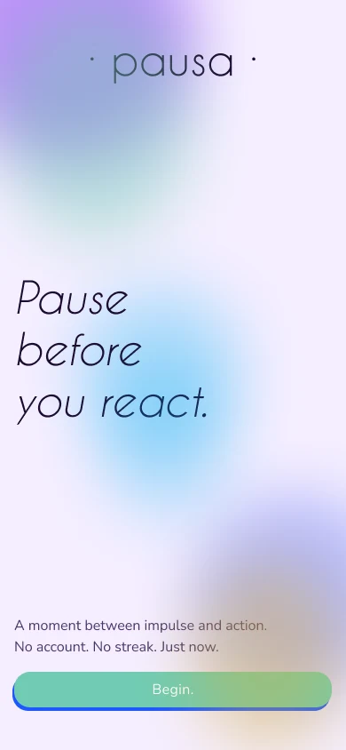
Pausa is an app for the moment between a trigger and a reaction.
It’s meant to be a tool that helps with overwhelm, and does not require you to enter a whole universe of content, creating an account or following a streak.
It just helps you disconnect, reflect, ideally nudge you to write on paper, and let go.
The gap
I interviewed seven people about the last time they reacted to something they wished they hadn’t.
I interviewed seven people about the last time they reacted to something they wished they hadn’t. Fifteen questions, from who they are to what they reach for when they’re triggered.
The gap between knowing and doing is the whole brief.
- 7/7reach for something other than a wellbeing app when they are triggered
- 5/7have tried wellbeing formats and bounced off, or never tried
- 5/7prefer handwriting for reflection, with constraints
- 7/7know what helps, and none of them always do it
The competition
Calm, Headspace, Insight Timer and Apple’s State of Mind and Journal are libraries, courses, marketplaces and logs.
Calm, Headspace, Insight Timer and Apple’s State of Mind and Journal are libraries, courses, marketplaces and logs. They’re built for a planned moment, and they ask you to know what you want: a goal, a program, a mood to log. That’s a lot to ask of someone who is already flooded.
| Calm | Headspace | Insight Timer | Apple Health | Pausa | |
|---|---|---|---|---|---|
| Primary model | Library | Course | Marketplace | Log | Tool |
| Entry trigger | Goal | Goal | Goal | Habit prompt | State |
| Moment of use | Planned | Planned | Planned | Retrospective | In crisis |
| Time to action | 3–6 taps | 3–5 taps | 2–4 taps | 2 taps | 1–2 taps |
| Needs self-knowledge | Yes | Yes | Yes | No | No |
| Account / data | Required | Required | Required | Apple ID | None |
| Paper path | No | No | No | No | Yes |
| Platform | iOS + Android | iOS + Android | iOS + Android | iOS only | PWA |
Persona
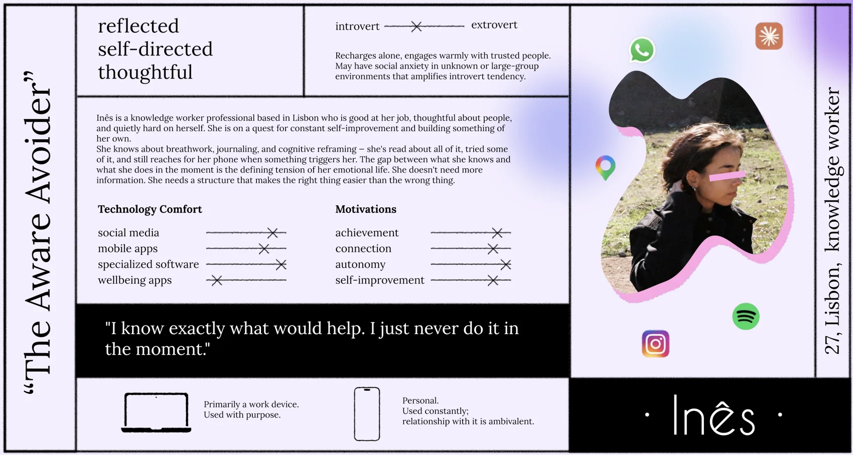
From the seven interviews I built one persona: Inês, a knowledge worker in Lisbon.
From the seven interviews I built one persona: Inês, a knowledge worker in Lisbon. She’s thoughtful, reflective and a little introverted. She has read about breathwork, journaling and cognitive reframing, and she still reaches for her phone when something triggers her. She doesn’t need more information. She needs a structure that makes the right thing easier than the wrong thing.
Four ways in
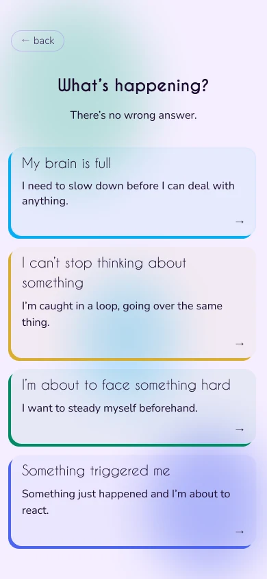
Pausa names what’s happening to you, not what you want.
Pausa names what’s happening to you, not what you want. “My brain is full” is easier to answer in the middle of a spiral than “I want to feel calm”. I put five entry labels in front of the seven people I interviewed and asked them to rank them. The fifth, “I just need to get it out”, I cut: paper does that better, and the Reactive flow already contains it.
The entry screen follows the ranking, with the strongest first.
| Entry | What happens | Average rank | First choice |
|---|---|---|---|
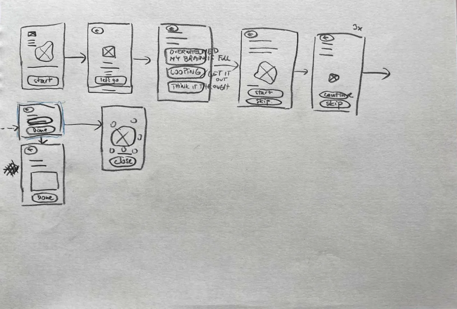
| My brain is full.Overwhelmed | Box breathing, then an optional bridge to writing. | 2.00 | 4 of 7 |
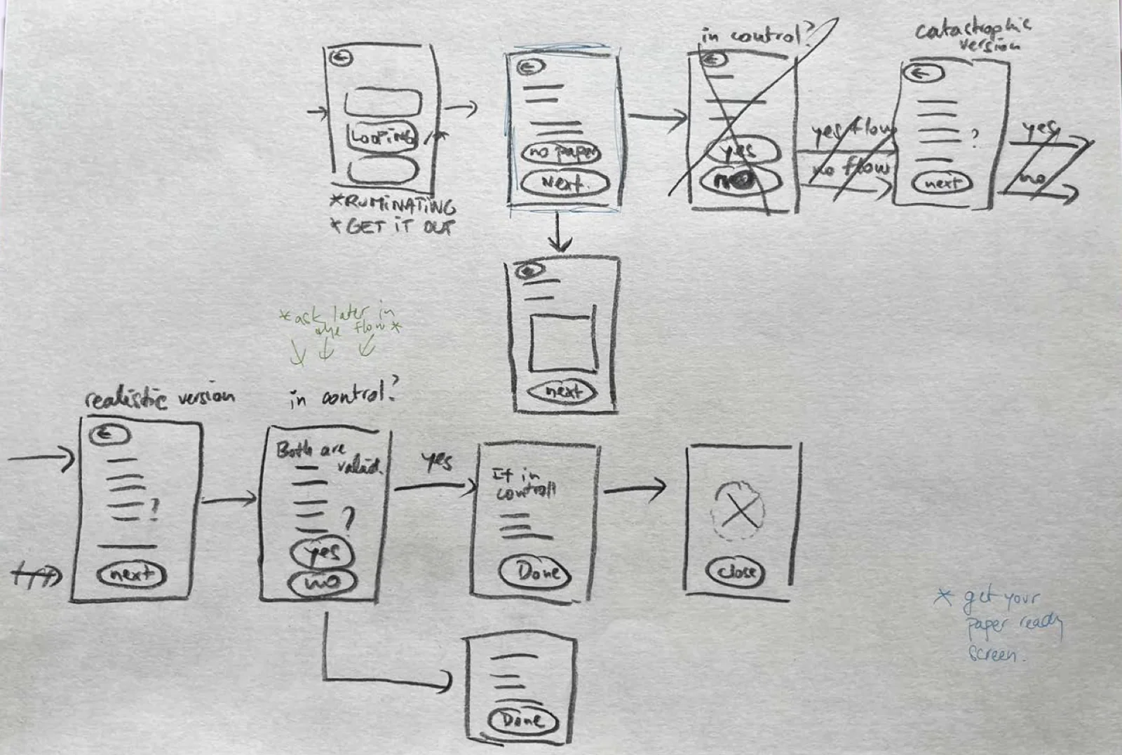
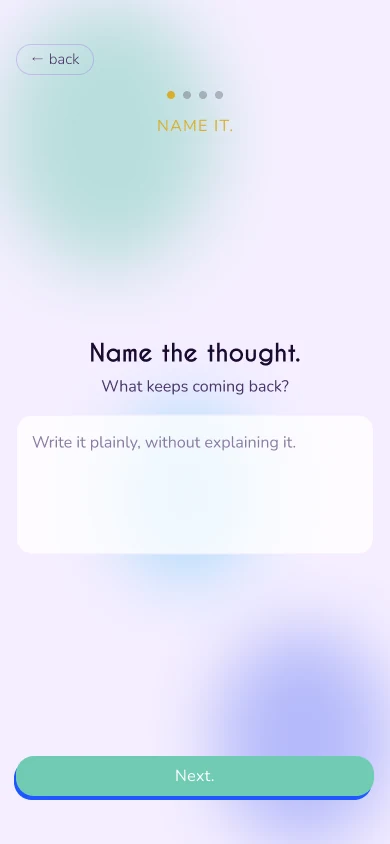
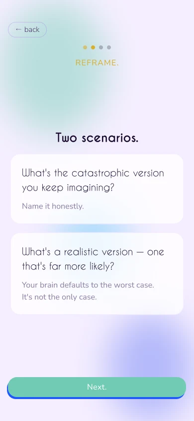
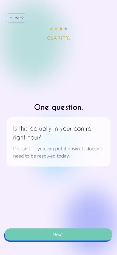
| I can’t stop thinking.Rumination | Name the thought, reframe the catastrophe, check what’s in your control, then act or accept. | 2.14 | 1 of 7 |
| I’m about to face something hard.Anticipatory | Name it, breathe, find the realistic outcome, set an intention. | 3.71 | 1 of 7 |
| Something triggered me.Reactive | Dump it, name the urge, answer three reframing questions, then act or do nothing. | 3.86 | 0 of 7 |
Two lanes
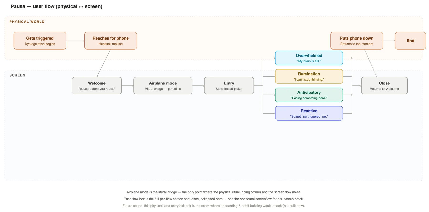
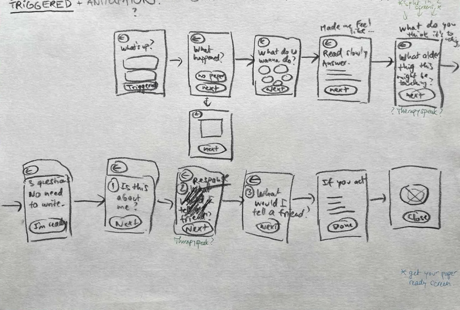
The flow has two lanes: what happens in the physical world, and what happens on the screen.
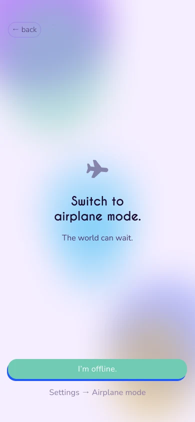
The flow has two lanes: what happens in the physical world, and what happens on the screen. The bridge between them is a ritual. Before anything else, Pausa asks you to switch to airplane mode, so the notification that pulled you in can’t pull you back.
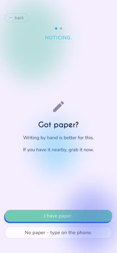
Five of the seven preferred handwriting for reflection, so the writing flows also have a paper path. The prompts are identical, and only the medium changes.
Look and feel
The look comes from James Turrell’s Skyspaces: light you stand inside.
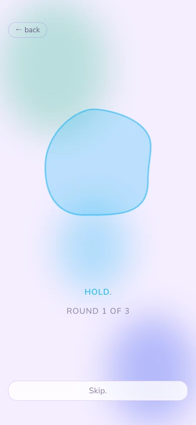
The look comes from James Turrell’s Skyspaces: light you stand inside. I stayed on the calm end of his spectrum, blues, violets and cyan, and gave each flow its own accent: the deepest blue-violet for slowing down, a lighter cyan-violet for working something through. Surfaces are frosted glass over soft, drifting blobs. The blobs are never perfect circles, and they’re also what you follow when you breathe.
- Main#761DF1
- Accent#1F57FF
- Overwhelmed#05AFF2
- Rumination#D9AE30
- Anticipatory#038C65
- Reactive#4B64F2
The app
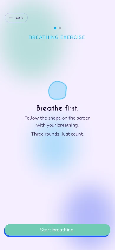
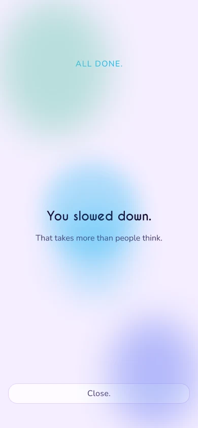
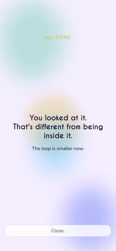
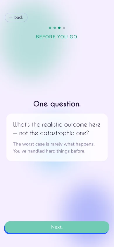
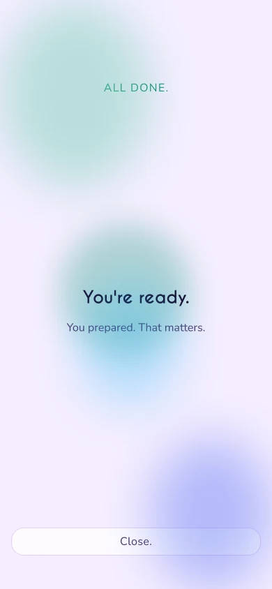
Four flows, one pattern.
Four flows, one pattern. Each one ends with its own closing line, and none of them lecture: “You slowed down.” “You looked at it.” “You paused. You didn’t just react.” “You’re ready.”
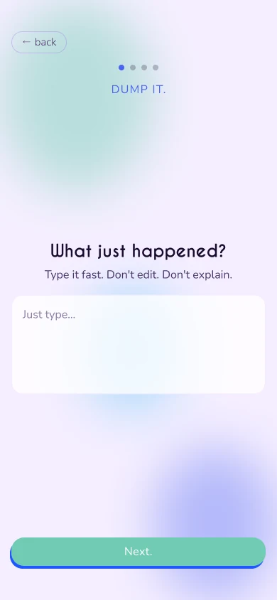
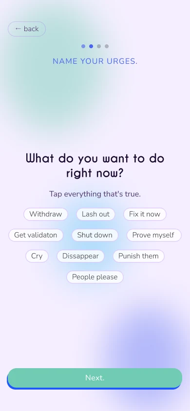
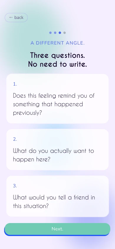
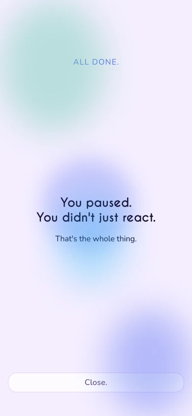
The website
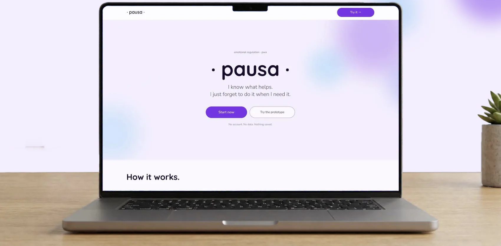
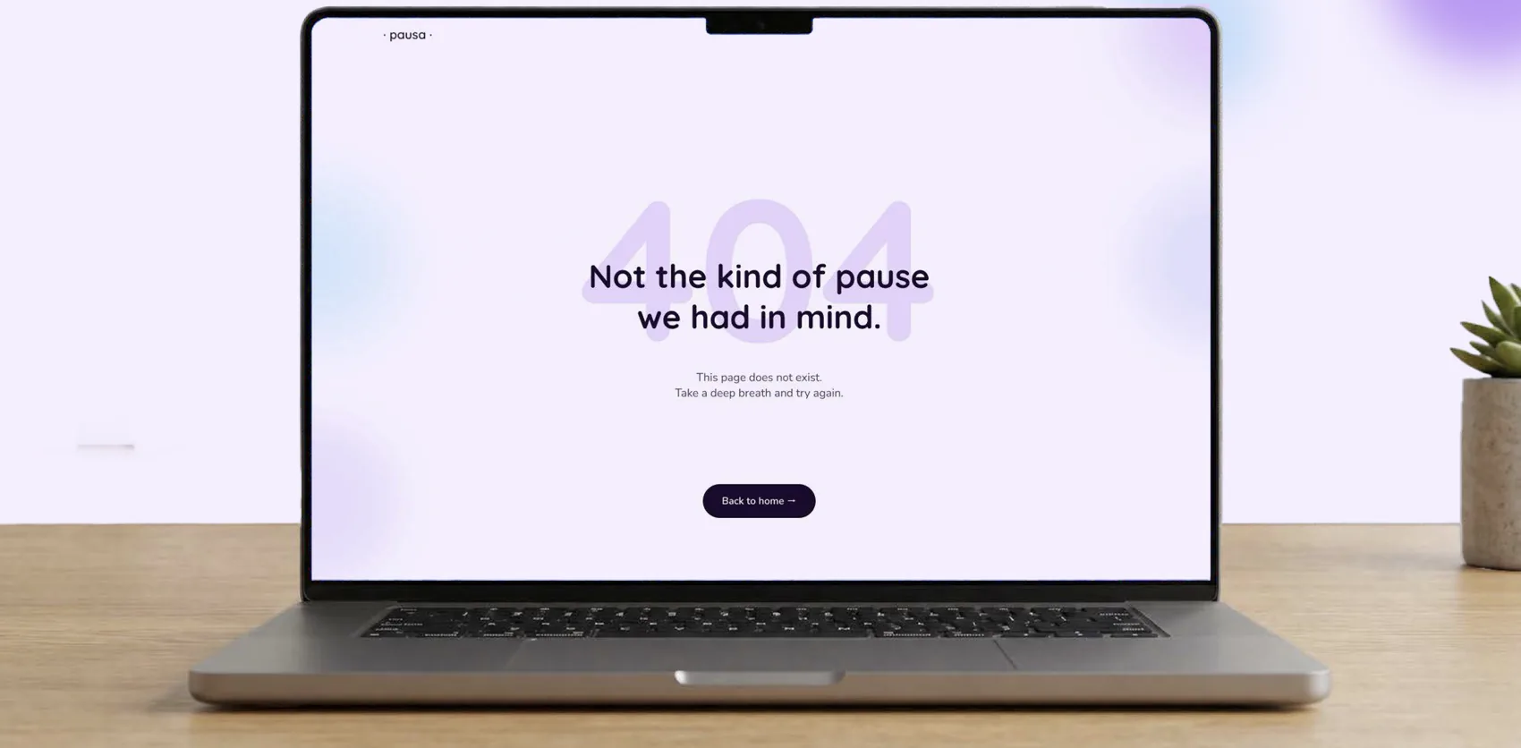
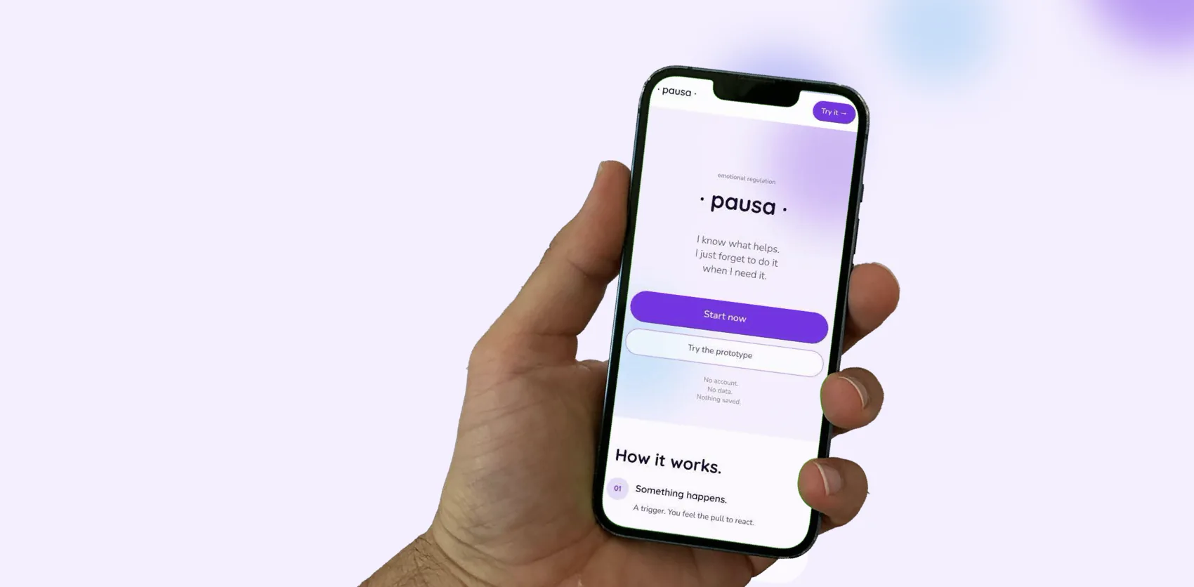
The app is a PWA, so it needs a front door: a download page that explains how it works in four steps, shows the four ways in, and makes the point that the process works without a phone, on paper.
The app is a PWA, so it needs a front door: a download page that explains how it works in four steps, shows the four ways in, and makes the point that the process works without a phone, on paper. The 404 stays in character: “Not the kind of pause we had in mind.”
The check
I checked the prototype against ten usability heuristics.
I checked the prototype against ten usability heuristics. Six pass, one is flagged, and three don’t apply or are deliberate.
The ten heuristics
| 1. Visibility of system status | Pass | Progress dots and the breathing countdown show where you are in each flow. |
|---|---|---|
| 2. Match with the real world | Pass | State-based entry labels mirror how people actually describe the moment. |
| 3. User control and freedom | Pass | Consistent back and skip controls. |
| 4. Consistency and standards | Flag | The ambient background wash reads similarly between flows. The intention was subtlety, but a future release may need more obvious differences. |
| 5. Error prevention | Pass | Free text only. Nothing is required to move on. |
| 6. Recognition over recall | Pass | Same process, different medium: paper and digital prompts are identical, and every flow follows the same layout pattern. |
| 7. Flexibility and efficiency | N/A | Deliberate friction is the point. Efficiency isn’t the goal here. |
| 8. Aesthetic and minimalist design | Pass | Frosted glass and the Turrell palette, with 60-30-10 held throughout. |
| 9. Error recognition and recovery | N/A | No error states are surfaced, because there’s nothing to validate. The 404 page belongs to the download site. |
| 10. Help and documentation | By design | No onboarding yet. The next stage would be onboarding, and it needs more user feedback to decide whether it lives inside the app for convenience or outside it, on a website, to keep the app minimal. |